Think of Instagram as a magazine. People arrive on your feed and see your whole layout.
BOOM!
If they are impressed. They will follow you.
How to impress? By sticking to an Instagram grid layout.
Let me explain:
Each square plays an important role in your overall Instagram feed.
You can create different Instagram layouts by planning each square.
Basically: A grid layout = a template = an amazing Instagram theme.
I am going to show you 9 types of Instagram grid layouts.
Want to try to create your own layout right now?
You can use Preview app to create your Instagram grid layout.
With Preview, you can move your posts around to create the feed layout you want.
Ready?
Let’s do this!
PS: Shout out to our amazing community! Most of the feed examples you will see below are created using Preview App ?
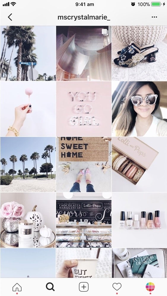
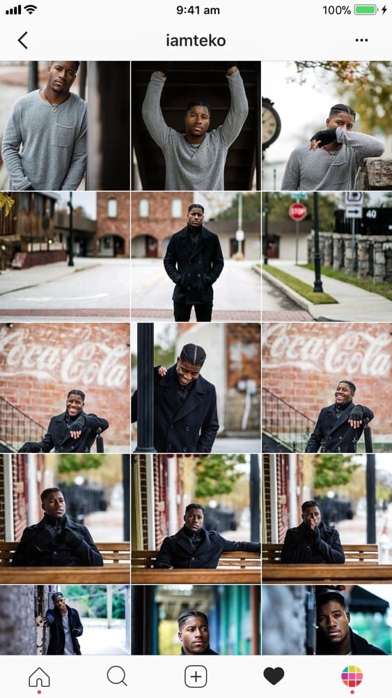
Instagram Grid Layout #1. Squares
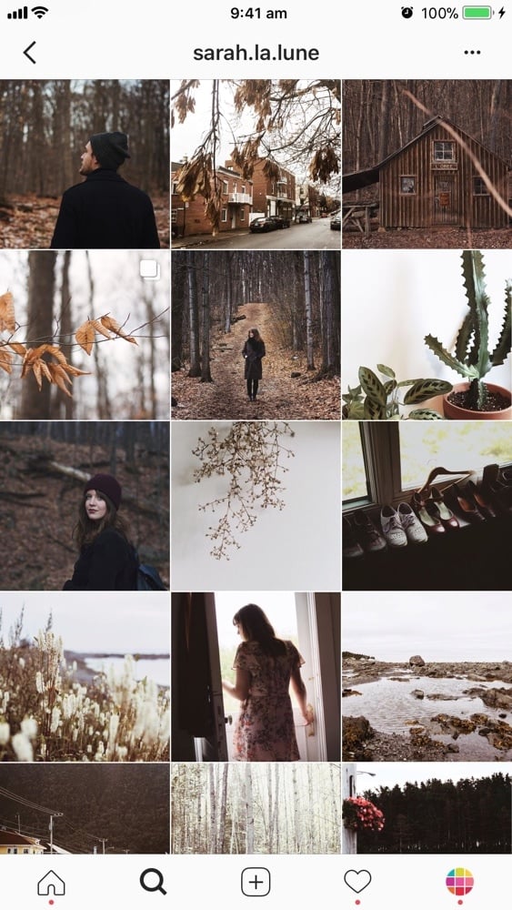
Let’s start easy. The first grid layout is to keep it simple.
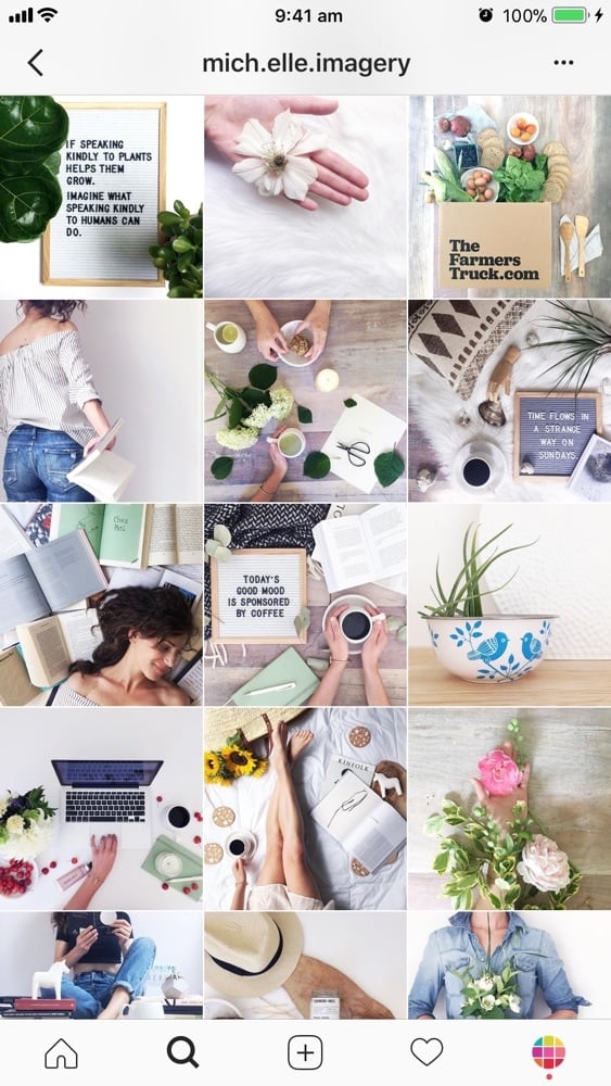
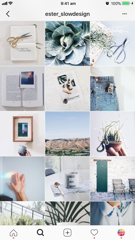
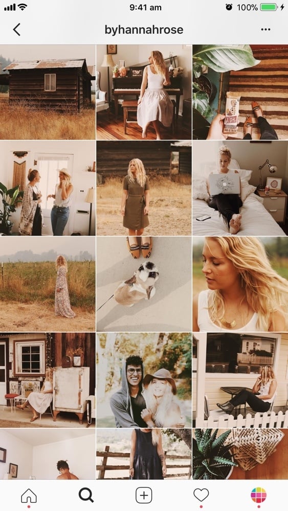
Just post your photo, each square at a time. You don’t have to stress out about your whole layout as such, as long as you stick to the same filter and color combination.
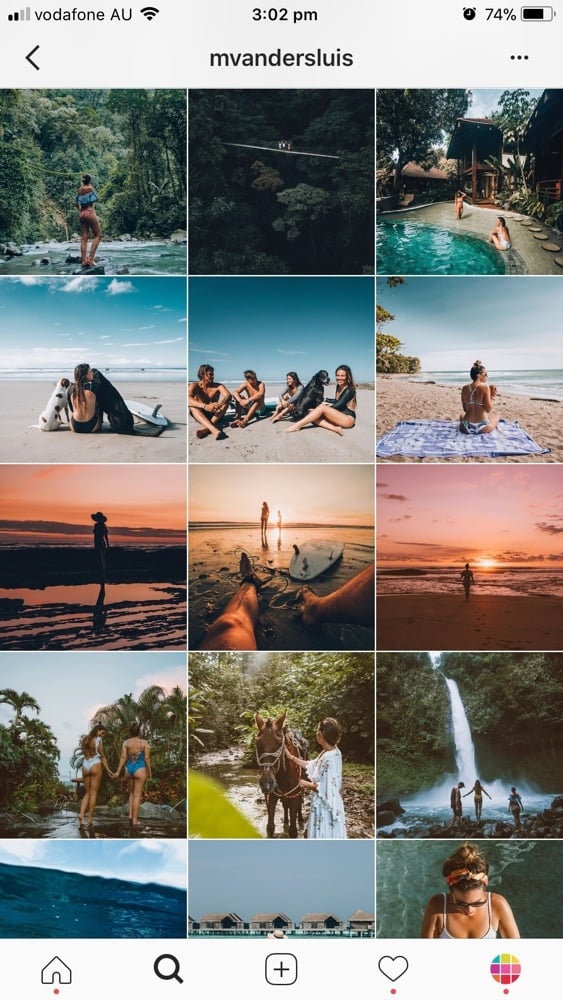
Instagram Grid Layout #2. Diagonal
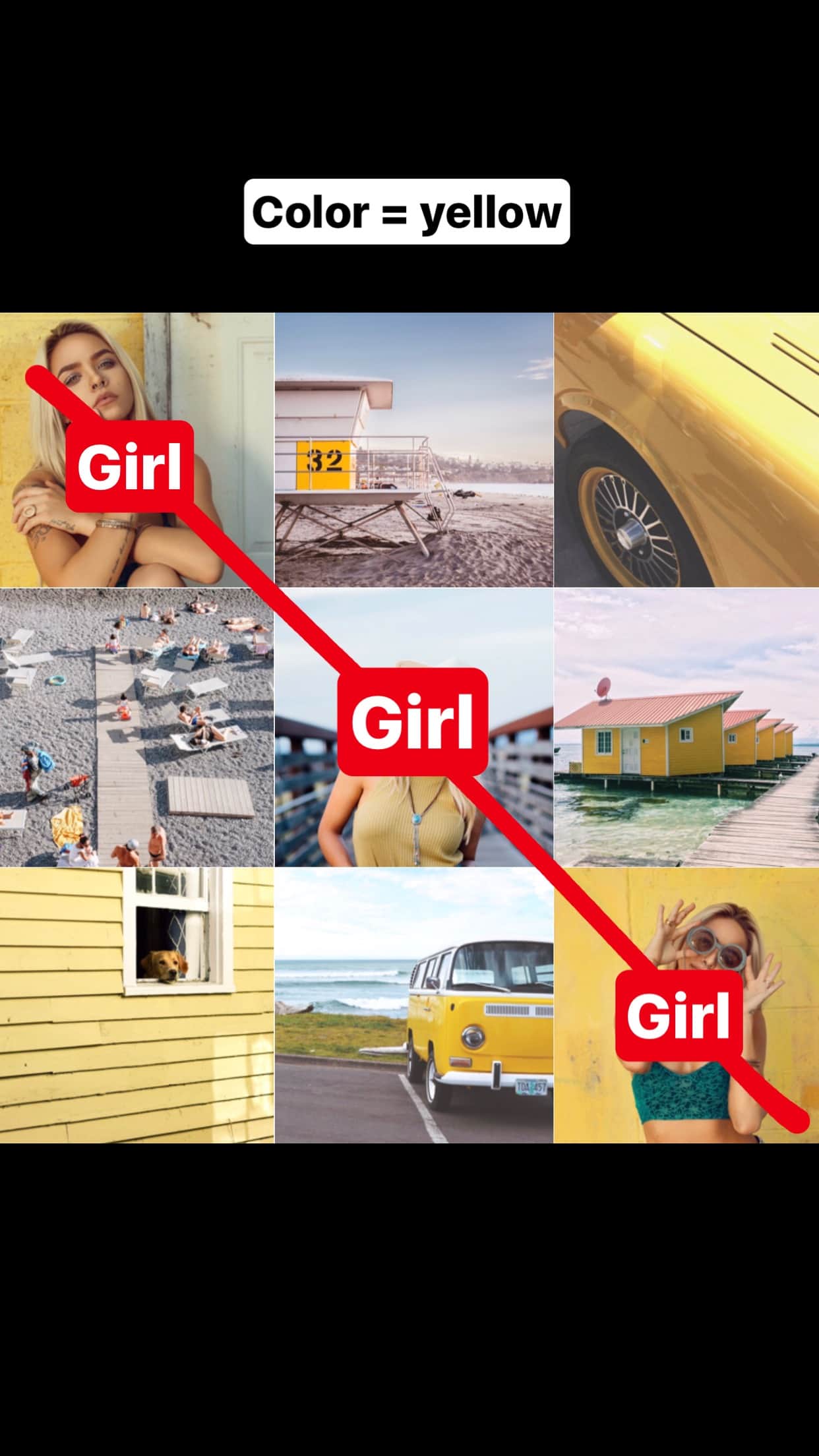
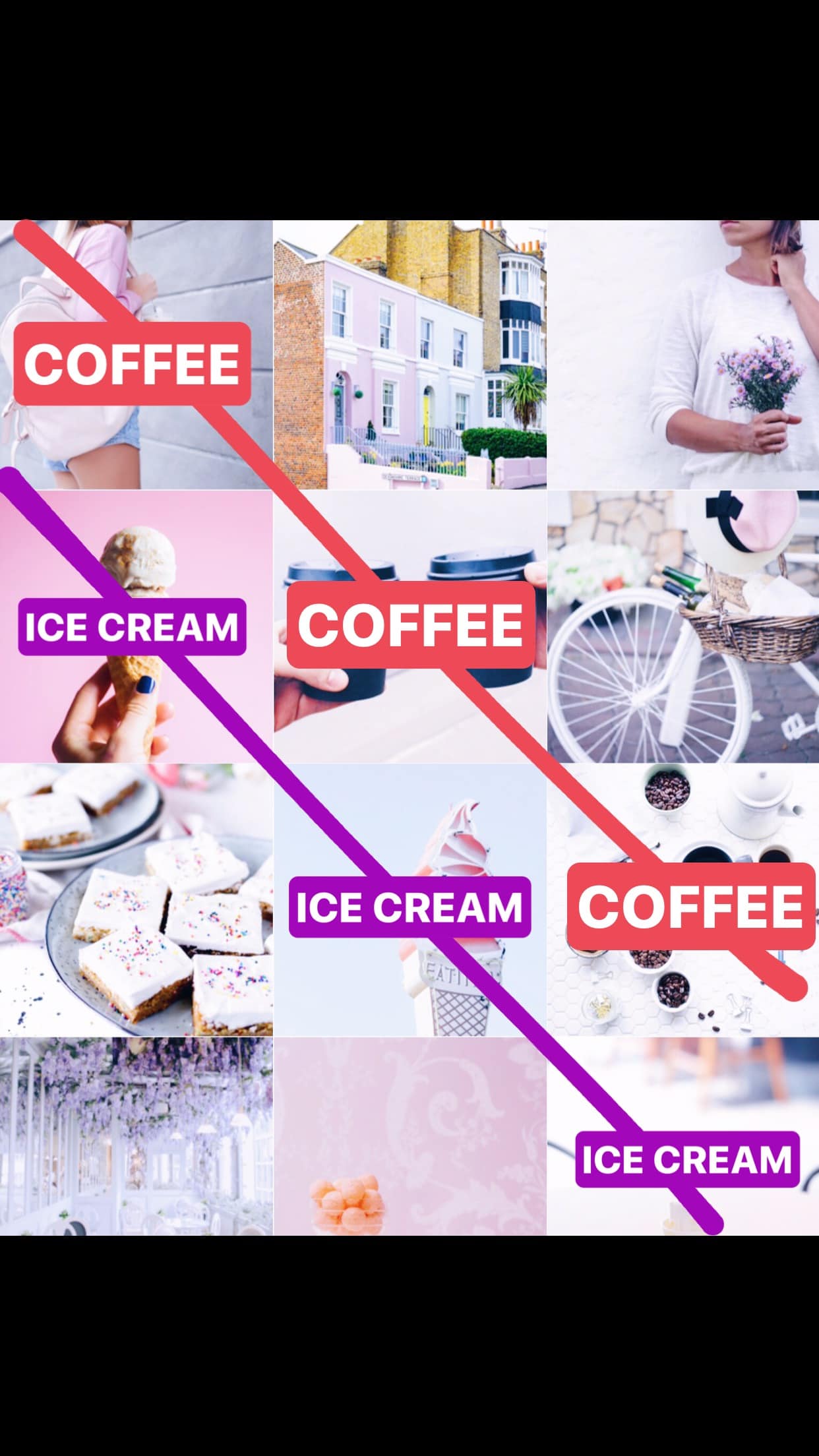
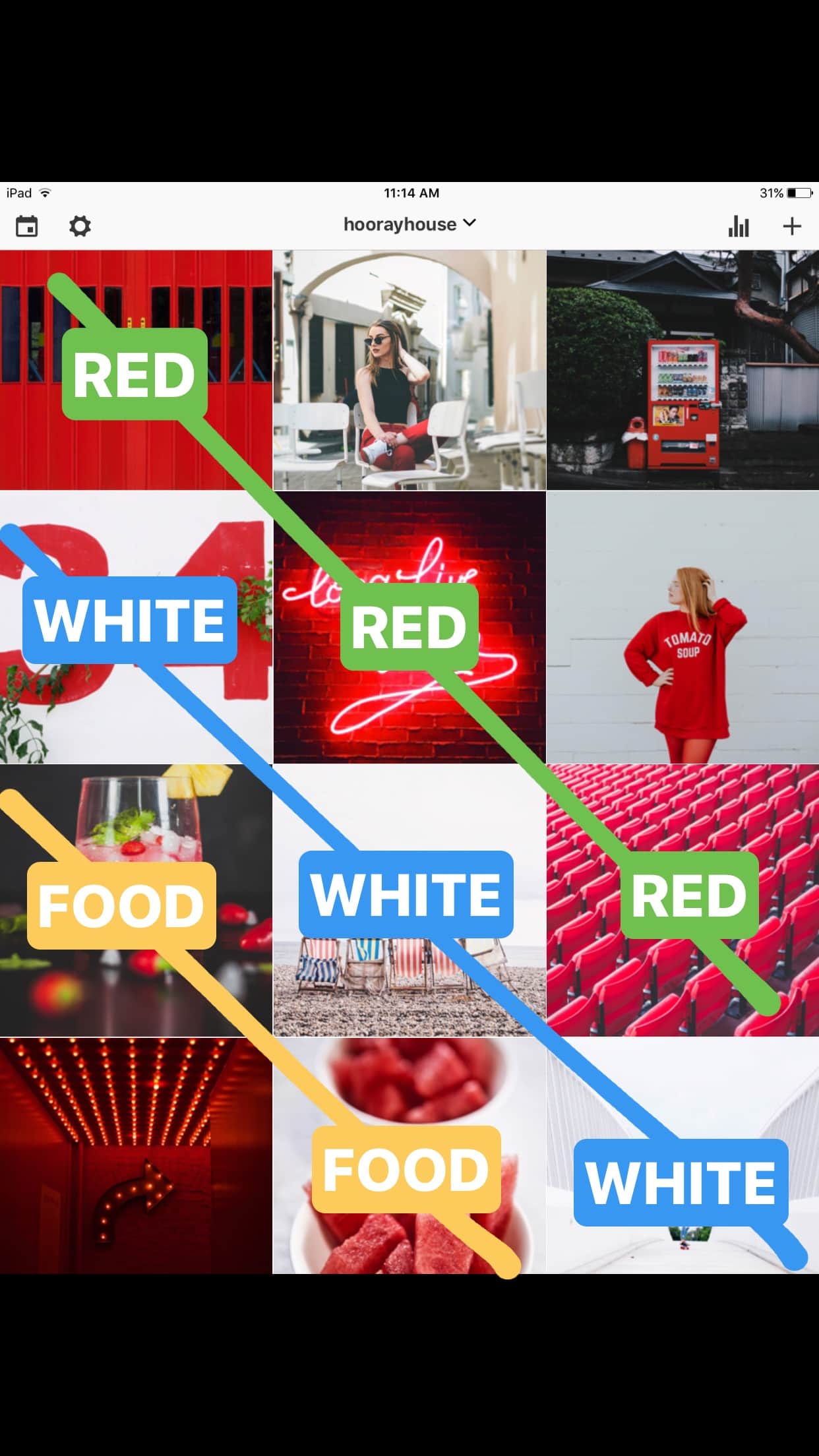
The second Instagram grid layout is used by a lot of Instagrammers. It makes your Instagram theme look consistent instantly. And it’s so easy to do!
The diagonal grid layout was explained by Amanda, the Creative Director of Hooray House, in our Insta Story. You guys loved this trick!
All you have to do is (1) choose a type of photo and (2) choose a color. Then just drag and drop your photos to rearrange them like this:
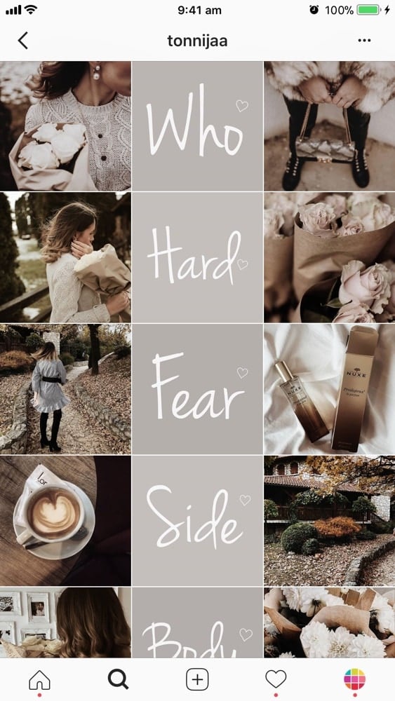
Instagram Grid Layout #3. Tiles
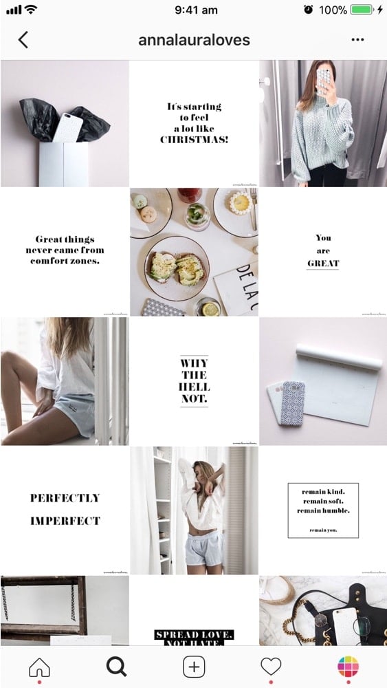
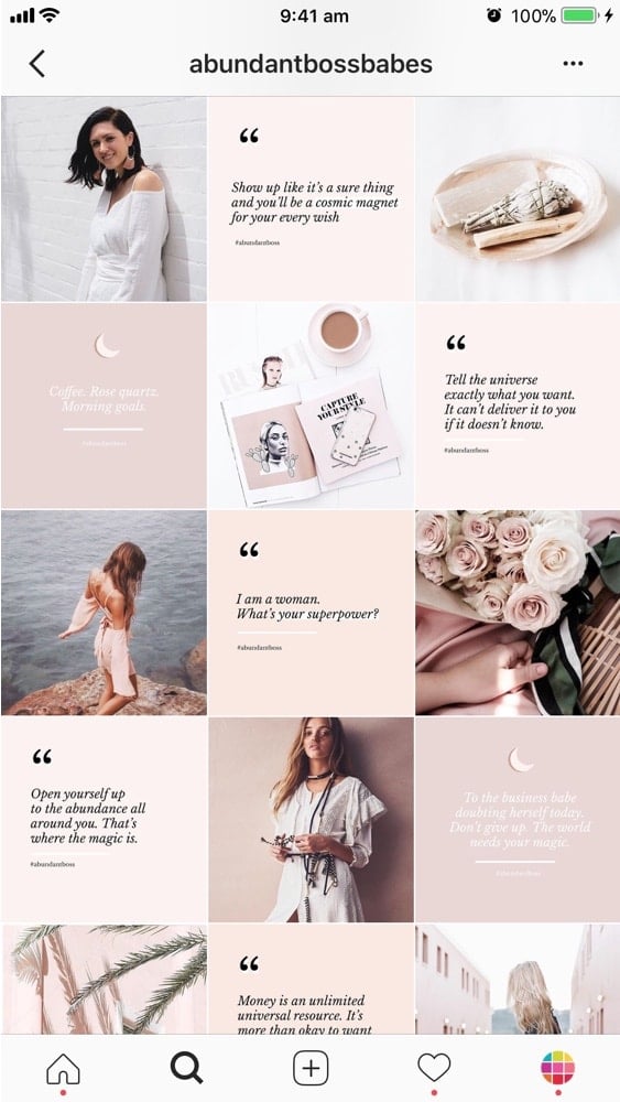
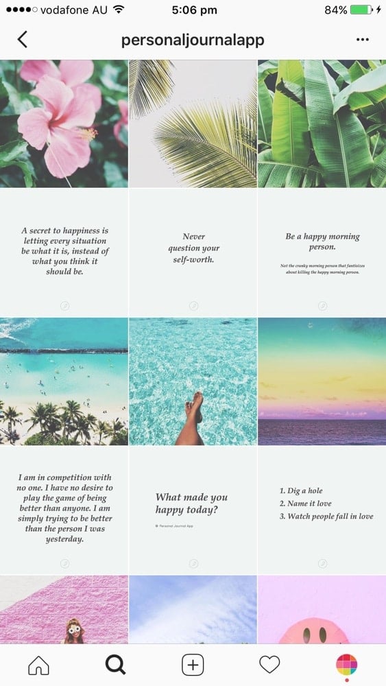
For this Instagram grid layout, use each square as a tile.
The most popular way to use this layout is by sharing a photo, then a quote, then a photo, then a quote.
It is an easy way to have a consistent Instagram feed. Super easy. Plus, your followers will know exactly what you will post next. If you have just posted a photo. They are expecting an awesome quote after.
Of course, you don’t have to only use quotes. Be creative. For example, you can share your new blog post title, an icon (like a heart), an emoji, a drawing…
Tutorial: How to Make a Tiles Instagram Feed?
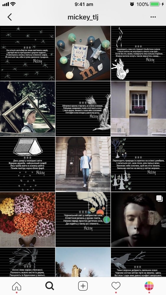
Instagram Grid Layout #4. Row-by-Row
This is another creative Instagram grid layout.
It is very beautiful because it looks like you are reading a book… or a magazine. Our eyes naturally go from left to right to read (unless you’re from Japan, then right to left).
Again, you can get very creative and tell a story. One row = one story.
For example, if you are traveling somewhere you could use a line to write about your travel tips, your experience or the name of your destination.
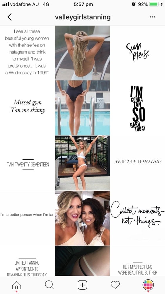
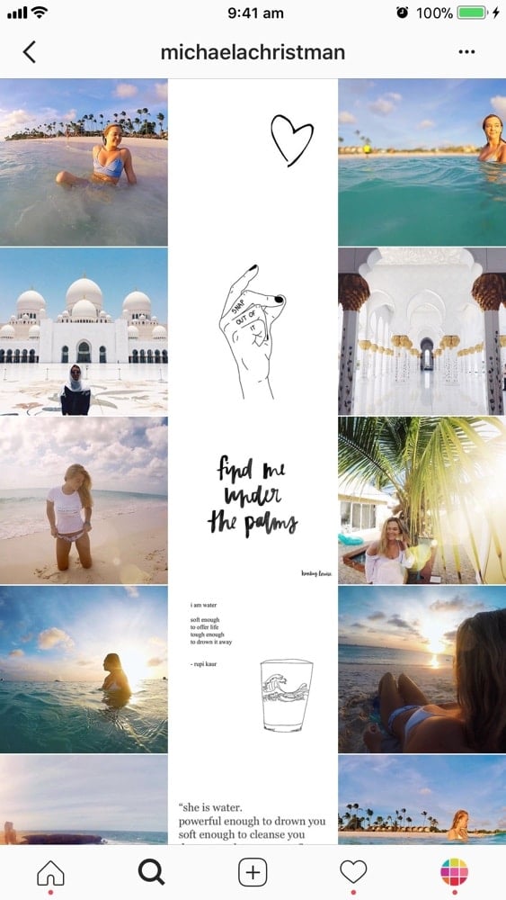
Instagram Grid Layout #5. Line in the Middle
This Instagram grid layout is one of my favorites.
This feed layout is easy to maintain and it is very pretty to look at.
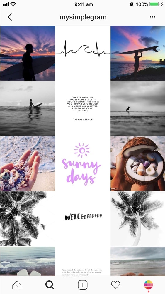
The line in the middle of your feed is usually quotes on a white background. But it can be anything you want.
That line in the middle will guide your viewers as they scroll down your feed.
This is so cool! It just makes you want to scroll, scroll, scroll!
Again, you can get very creative with what you decide to put on each side of your middle photo. You can keep it simple and just post any image. Or you can be more intentional. How does the text in the middle relate to the images on each side? Just a little something to think about…
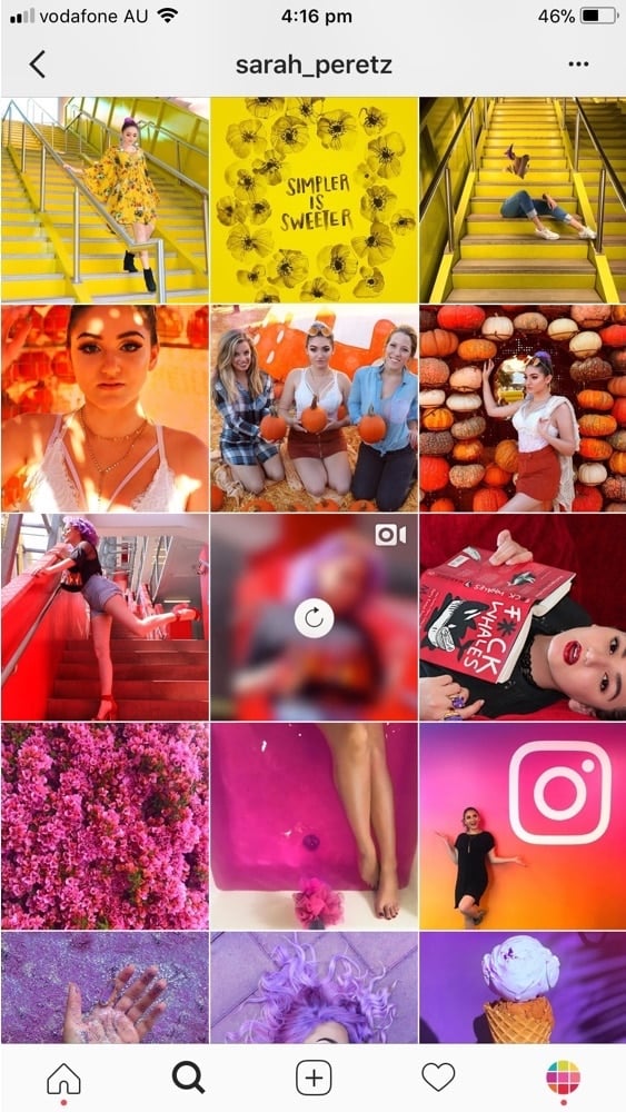
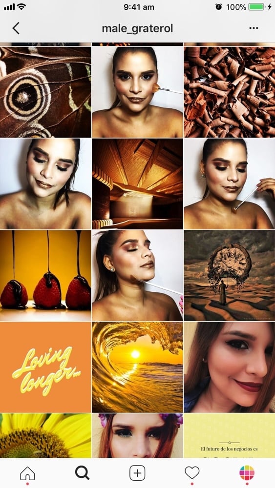
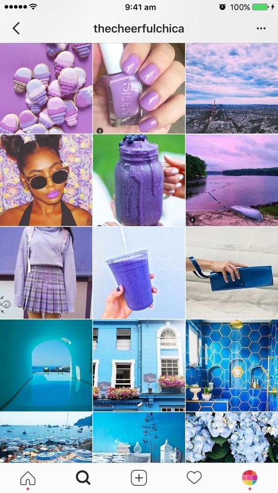
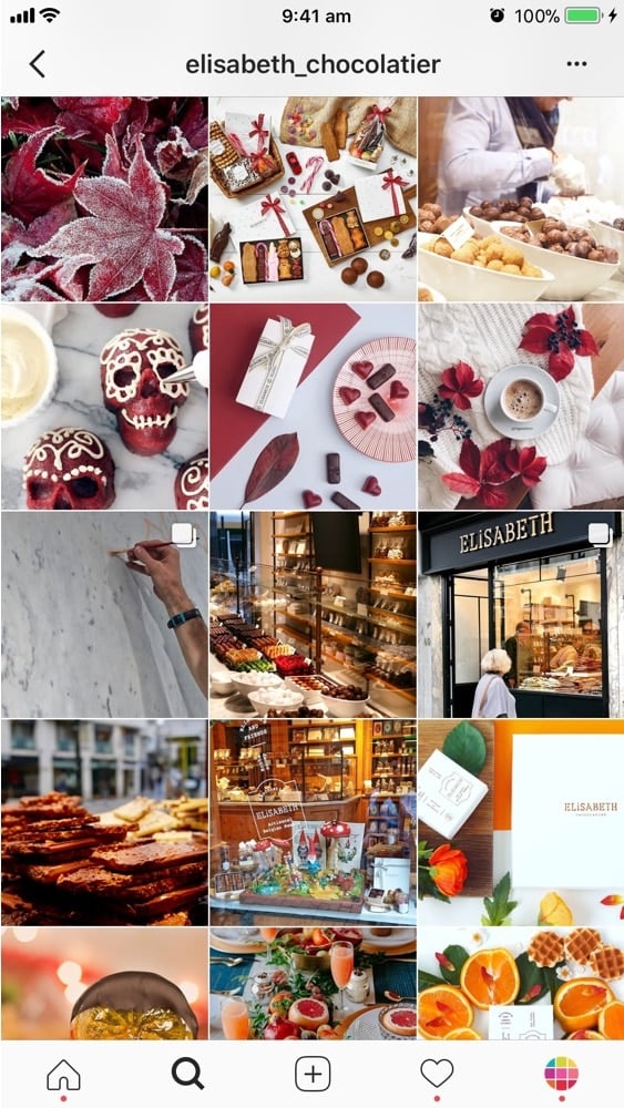
Instagram Grid Layout #6. Rainbow Feed
This is a pretty cool grid layout too. A rainbow feed is when the color of your feed changes when you scroll. It requires a little bit more work and planning than the other grid layouts. If you pull it off, your account will definitely stand out. It will look like a rainbow. Use a different colors in your photos after every 3, 6 or 9 photos for the best effect
Tutorial: How To Make the Perfect Rainbow Feed?
Instagram Grid Layout #7. Borders
This Instagram feed layout stands out too!
Favorite white borders in Preview app: Aura, Sole, Vela. Preview also has other borders like circles and black borders. Take your time to experiment.
Tutorial: How to Add White Borders on Your Photos?
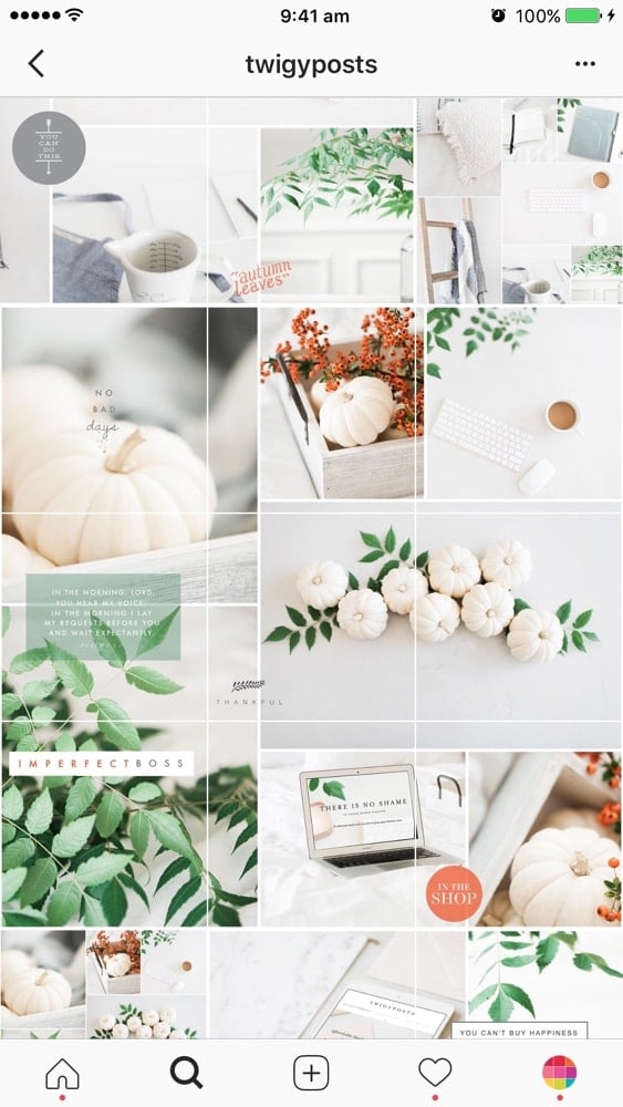
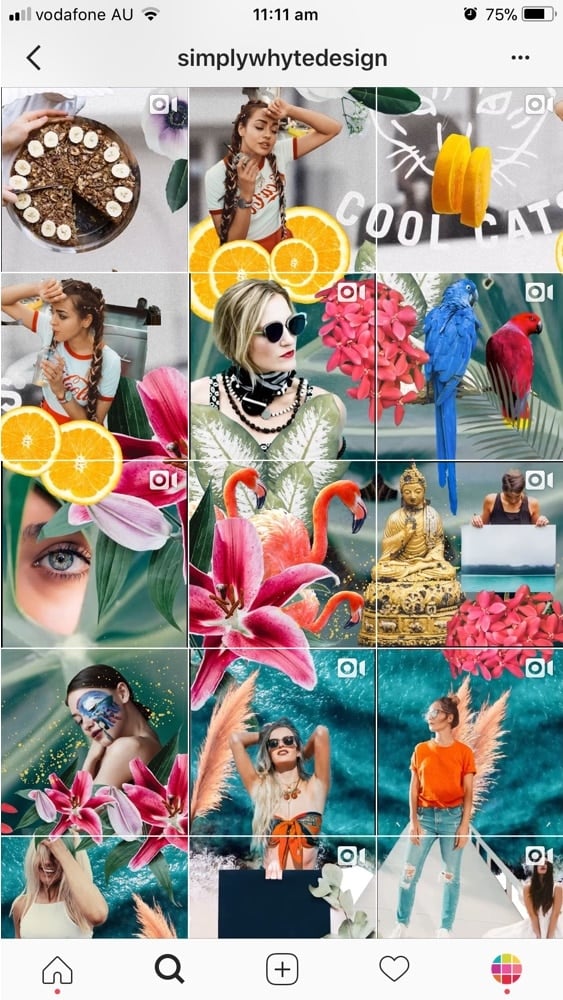
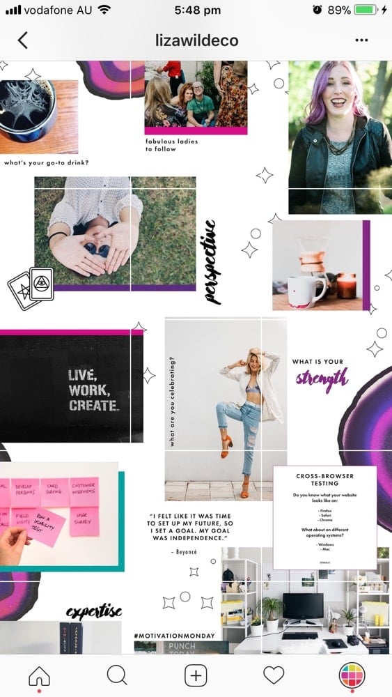
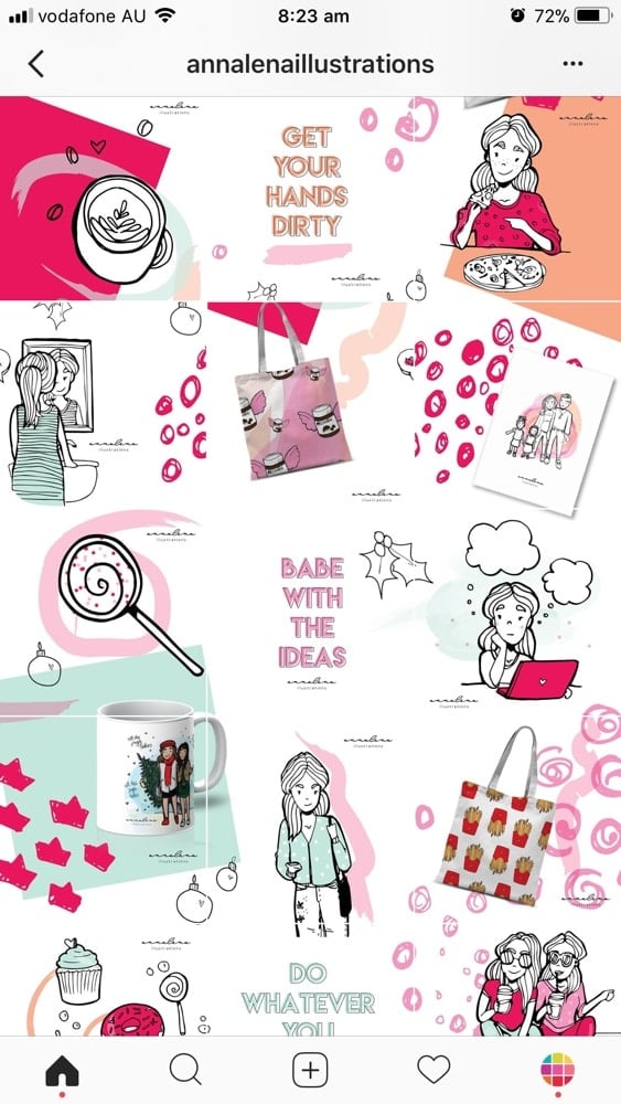
Instagram Grid Layout #8. Puzzle
This is a next level grid layout. The trickiest part of doing this layout is maintaining high quality of each single image after you split it. You also want to make sure that each individual photo makes sense on its own (otherwise people won’t click on it).
Instagram Grid Layout #9. Mix
If you want to go one extra mile, try to mix different types of grid layouts:
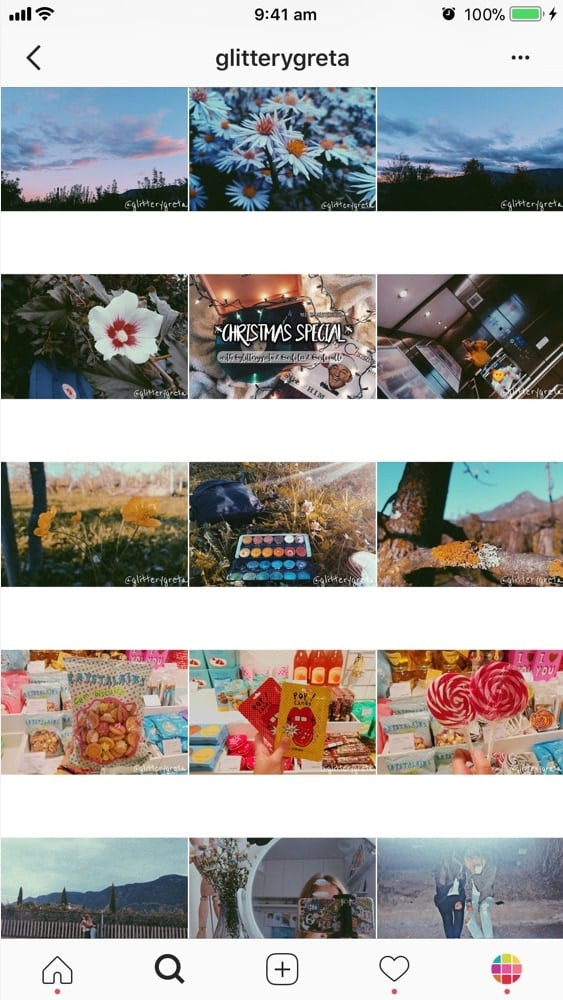
- @glitterygreta: one row = one story + white border
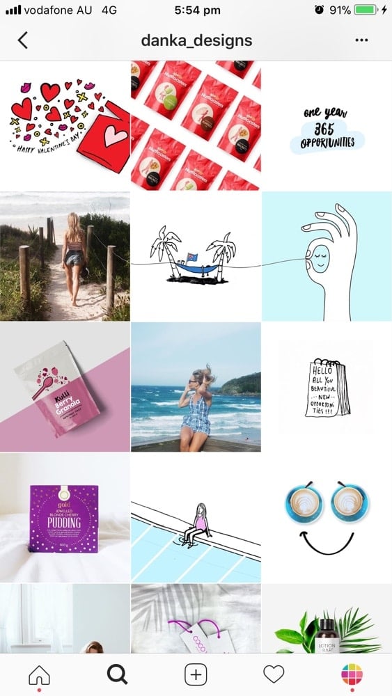
- @danka_designs: puzzle + squares
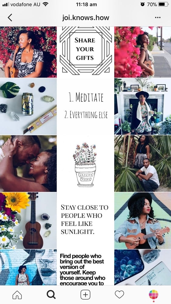
- @joi.knows.how: line in the middle + row by row
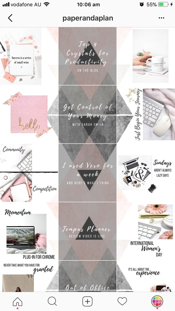
- @paperandaplan: line in the middle + puzzle
If this article was helpful, please leave a comment below.
And if you want more tips to plan your grid, you can download our Complete Instagram Guide.
Have fun!
Alexandra


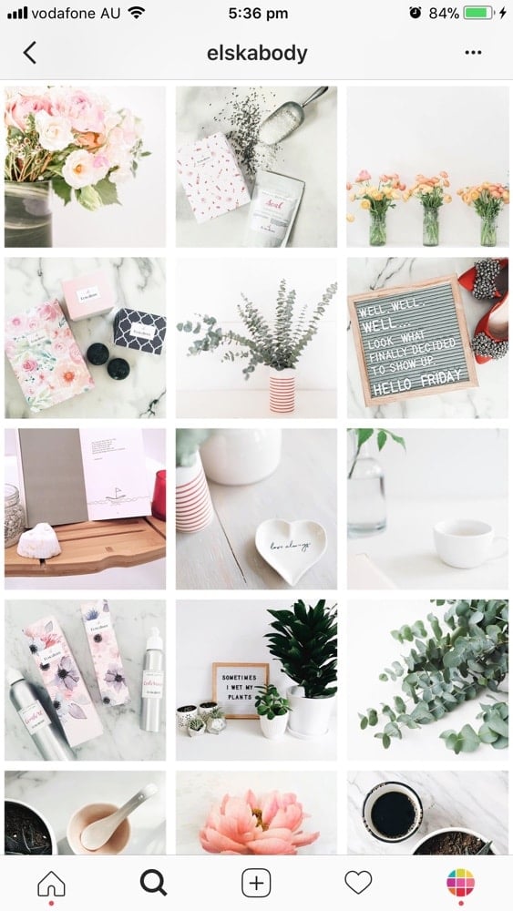
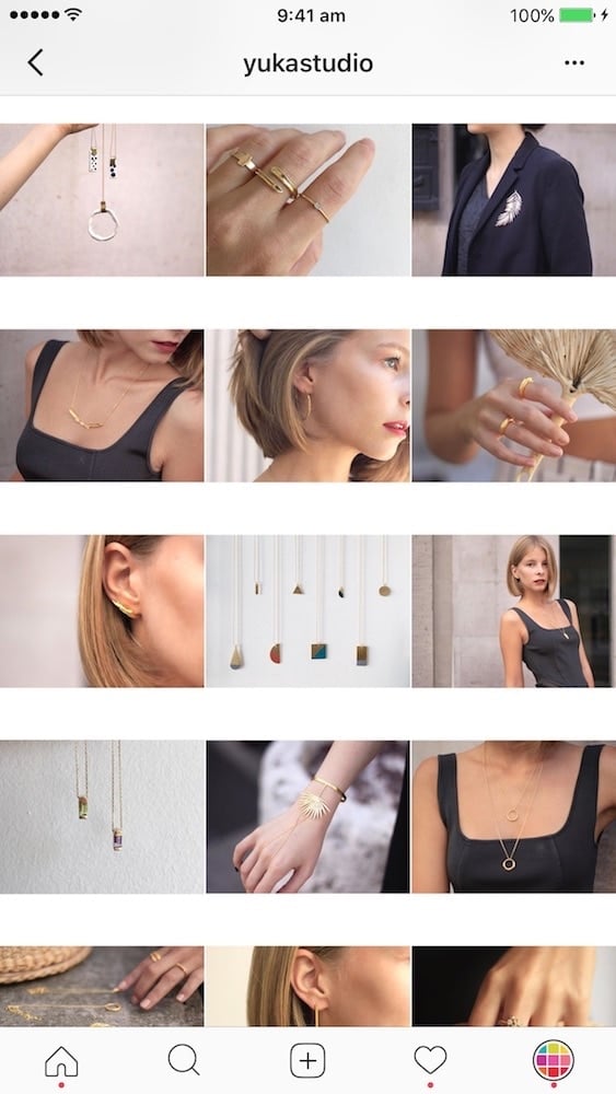
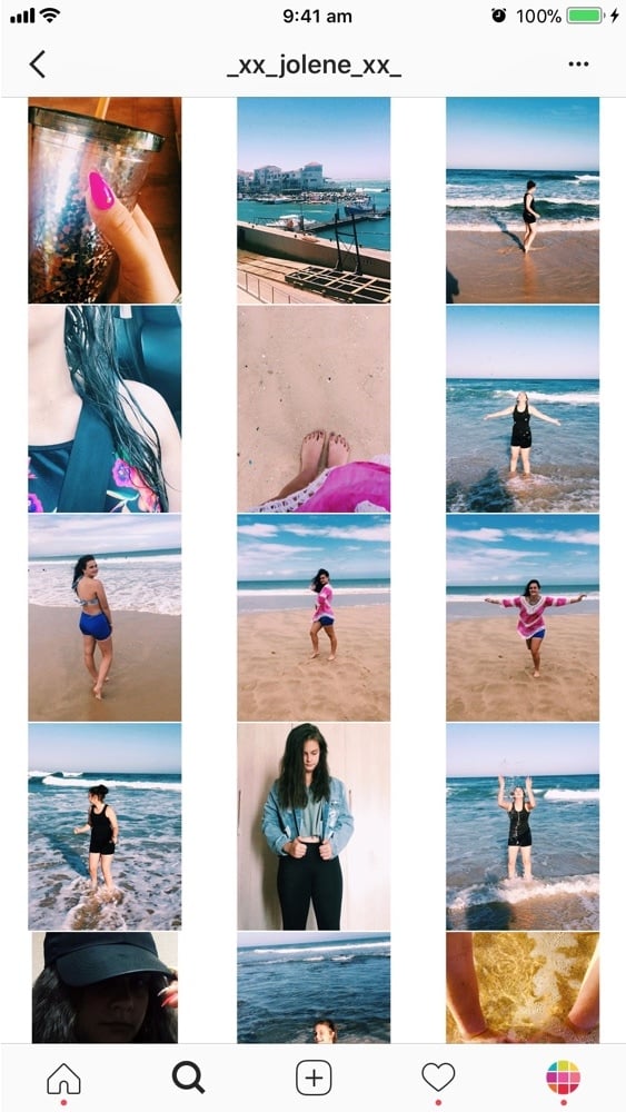
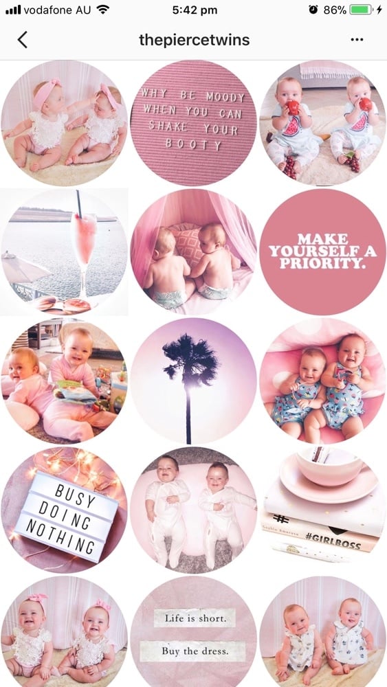

I just came across this post randomly and as it happens my Instagram profile is Tile + Color by Block! I’d love you to check it out. @christinamolinadotcom
Hi Christina! You actually did it and it looks awesome! I’m going to add you to the article. Thank you so much for telling me!
what app are you using for this layout?
Hi Charlotte, try to prepare 9 photos with the same color combo. Then switch to another color combo for the next 9 photos – and so on. As for the posts themselves, Christina seems to alternate between post with a quote and then a post with a photo. Then just drag & drop in Preview app to make your layout flow. I hope that makes sense?
This is brilliant. How do I go about getting the line down the middle? Do I need to post 3 each time to keep it in the middle?
Or is there a way to have say, first line red, middle blue, last line green?
Thanks
You’re right. You have to post 3 photos each time to keep it in the middle. But you don’t have to do that all the time. A lot of people doing this theme don’t post 3 photos straight away. You will sometimes see their white line is on the left or on the right, not always in the middle. Another tip: you can post 3 times a day, this way people will see the white line in the middle more often. Does it help?
Fab thank you x
You’re video was amaze balls!!!
I’m so happy you liked it! 🙂
I’m on instagram @life.lessons.to.share – I would love your feedback!
Hey there! I had a question similar to the girl below, I want my quotes to be all the way down the middle, does that mean I need to do picture /picture /quote to keep it centered?? I have been working with a couple of planner apps but it’s just not coming out right on my actual feed :/
Hello! Every time you will post an image it will shift your entire feed. That’s how Instagram works.
If you want to keep your quote in the middle, always post 3 photos at a time:
line 1: photo / quote / photo
line 2: photo / quote / photo
line 3: photo / quote / photo
line 4: photo / quote / photo
Etc…
Does it make sense?
I’ll make a YouTube video about it soon 🙂
thank you so much.this helps.would love to see the video
Here it is: https://www.youtube.com/watch?v=oWCucoCYkxM 🙂
Hi Alexandra!
This was helpful to me as well. I have a question: If you have to post three times everytime to keep the look consistent, don’t you lose engagement? General, people don’t interact with more than one, so does that mean that flooding them this way may lead to lower interaction overall?
Hello April! I agree with you. People tend to post once a day (or once every two days) now. That’s a trade-off. Then again, if you decide to post 3 times a day, I would suggest to use different hashtag groups for each post – this way you reach and engage with different people throughout the day.
Have you saved some hashtag groups in your Preview App already? Here’s how if you’re wondering: https://thepreviewapp.com/easiest-way-save-hashtag-groups-instagram/
One more thing: Instagram has changed its home feed algorithm this year. Two things can happen:
(1) you don’t post often, your post can be shown 1 or 2 days later — if people missed it, or
(2) you post more often (let’s say 3 times a day), you could increase your chances to be shown more often and on top of your followers’ home feed (more engagement?)
These are some things to consider for engagement. I’d say it all depends on the content you share (do you have a business or personal page?). Depending on the content you might get less or more engagement.
Does it help?
Thanks!
Hi All!
I’d like to share our experience.
on our IG account http://www.instagram.com/mediabetsrl we tried to alternate photo with infographic and photo with quote over panorama; photo with quote over panorama or food or some objects.
We experienced that Inspirational quote develop more applause and engagement rate but the best result you have if you put inspirational quote over quality pictures.
We embed some of these Instagram feed here: https://www.mediabetaprojects.com/enjoy-instagram-premium/grid-view-instagram-plugin/ where you can see our results.
What do you think? https://uploads.disquscdn.com/images/aa3b13c175f0ff8c15929d3dc4fd313343491aa0aa88d9b21f4d659ec6eae8e2.png
Hello! Great article! I was impressed to see I follow some of the steps without having search for it (this is the first article indeed about colours and themes…)
What I do though is a different kind of Tiles+Lines+Columns.
Though instead of quotes I use 1 “empty post” (minimal background ) / 1 “full post” (busy background).
And in the meanwhile I try to match horizontal lines by theme/place and columns by subject (1:person+pet, 2:nature+green, 3:ocean+rocks)
Check it out @locaali.world I would love to hear your opinion!!
Thank you!!
You’re welcome! Have fun creating your feed!
Interesting.. I’m currently doing “mini-themes”, I use the same theme and colour for three photos before I change once again. I don’t always post three photos at the same time, since it can actually look kind of cool when it starts to move down. However, when I have three perfect lines, I try to keep it for a while before posting again 🙂
IG: @forcebacka
Mini-themes are so fun! I just wrote an article about it too https://thepreviewapp.com/how-to-transition-instagram-theme/ . I just checked out your feed, it looks super cool with the different colors!
I forgot to tell you, but I’ve found that the best app for planning your feed and checking the colours match perfectly is an app called UNUM. Try it out – it’s super!
IG: @forcebacka
Thank you so much, this article is really well written and organised!!
You’re welcome Jade! I’m very happy it’s useful 🙂 Are you using Preview App too?
very helpful..thanks!
You’re welcome!
Hi Alexandra, I wrote an article about this topic “How to manage you Instagram photo grid: some simple secrets” https://www.mediabetaprojects.com/enjoy-instagram-premium/how-to-manage-you-instagram-photo-grid-some-simple-secrets/
I would like to have some feedbacks from you!
Enjoy your day!
Francesco https://uploads.disquscdn.com/images/c7984020986e425cf3cc7f731480bb359d85db2df718e719436f7e9b2cab0040.jpg
Hi!
Im admin of http://www.instagram.com/Mehrazincoshop page of Instagram and found this Post Helpful. and thannksss!!
You’re welcome! I’m really happy it is useful 🙂 have fun creating your Instagram page!
Thank you for your article! I was hoping to get an idea on how to resize and upload photos of the same size, like in the profiles of Photographers. I’m a photographer but I’m struggling with this! Would really appreciate some help.
Have been looking for something like this for ages! LOVE IT!! Downloaded your app and can’t wait to use it too!
That’s awesome! Let me know how you go with Preview!
I love it so much! I have my IG feed planned for the next 5 months! The only thing is that when I post, the image does not delete, but it’s not a big deal. The other thing that would be helpful would be team collaboration, and better scheduling. E.g. I love the function where you can swap two or more pics but in other apps like Later, if you do that, the scheduled dates swap too. It gets very hard to manage if I’m swapping pics but the schedule date stays the same. Happy to give more detailed feedback / elaborate! [email protected]
Finest Execution on the Instagram’s Layout.
Can’t wait to use this layout…..
Just Loved ITTTTT
Thank you! 🙂
So amazing, the rainbow theme I like it so much. I will mix the rainbow and the diagonal. Thanks
Awesome idea!
Thank you for the advice! I’ve found it really useful. Alongside my personal IG account, I have one for my artwork. The past posts I’ve done to me look messy and unattractive so I’m starting again from scratch. I was thinking a checkerboard look by using black and whitw borders. aimeebridgesartwork is my username so feel free to have a look and any feedback you have would be much appreciated: )
You’re very welcome! I’m really happy all the tips and tricks are useful. What you’re doing now with the white borders is really cool too. It gives space between your artwork so we can appreciate each one of them individually. Good idea!
Thank you! It also feels more organised to me and already I’m doing better with the likes so more people are noticing my work. I’ve realised just taking a little more time and thinking about your post has such a difference!
I’ve been using the preview app and the line in the middle grid. I absolutely love how my Instagram page looks. It’s inviting and makes me want to scroll through it ? Thank you guys
So happy you’re loving it! It’s pretty addictive to scroll through this kind of layout ? Thanks for dropping by Tamara!
I love it I just wish I could insert a pic instead of having to swap, because if I have a good thing and I want everything to just move down so that I have room for a new introduction, I have to swap one after the other after the other.
This feature is coming soon! Keep an eye on our updates.
Alexandra, this is a great article. I have learned a new thing today. I will now implement these design in my clients’ page. I loved the “Mix” grid style. Thanks for writing the article. 🙂 🙂
These are such great tips Alexandra! I’m just trying to get my rainbow feed up to speed, if you have any further tips I would really appreciate your feedback: http://www.instagram.com/teaprouk
Thank you loads!!! Tatjana xx
PS: I’m an avid user of Preview app (don’t know how I’ve survived without before) hehe
tatjanaapukhtina ):
This is really helpful! I am about to start my business instagram page so this will definitely help make it look good. I was wondering is there a way to add a logo to my photos before I post them? Also is there a way within the app to use two photos as one post like layout. thank you
Really happy it helps! 🙂 At the moment Preview doesn’t have the feature to add a logo on top of your photos before you post (we’re working on it). However, you can use the Text Tool that is inside the Photo Editor section and add your business name (or Instagram username) for now. If you want to put your logo, then you can use an app called “Canva”. Upload your Instagram photo and add your logo on top.
i need this!!
Really helpful tips. So many different options to choose from. Planning my grid in advance helps in building a loyal audience.
Awww love the feature! I manage @valleygirlstanning and my friend said she saw this on PINTEREST ???????
Some other accounts I manage using preview are… @studiovfitness @pilatesbrunchclub @modestoreforms @plainjanephotography and then my personal(and private ?) page @ms_sara_jane THANKS AGAIN for the feature and keep up the amazing work!
Small world! We love how you used the line in the middle ? and oh my… you’re managing so many accounts. You’re doing an awesome job!!
Thanks. Was very helpful
You’re welcome 🙂 glad you liked it! Have fun planning your feed now.
This was super helpful! Thank you so much for sharing!!
You’re very welcome! Have fun with your feed!
Nice post, and its quite informative, this article help to know more about the content, Great work. INSTAGRAM. Thank You so much, Keep Posting.
Wish you guys had a template for an ongoing image like @sweetener
Thank you so much for this article!
I launched a streetwear brand and had no idea how to plan my Instagram. After reading the article the “line in the middle” layout inspired me to do a line on the left instead and I’ve seen my following grow!
Here’s my Instagram if you want to check it out 🙂
https://www.instagram.com/official.streetbeast/
Extremely helpful
I just downloaded your app and I can’t wait to use to help me theme my instagram!
Thanks!! <3
Great!
What do you think of my feed?
http://www.instagram.com/AlanFLucero
Thanks for this! We’re inspired and ready to get cracking
You’re welcome. Have fun!
Absolutely fantastic tips. Thank you!
I remer this very nice,
duesudue wedding
Thanks to all, maybe only one, who worked on this content))))
You are amazing))))
Thank You very much for the information. It helps so much))))))
This is so useful and interesting!!! <3 Thanks for sharing
My layout style is getting lots of appreciation from everyone.In case you want some tips, here’s my feed ?❤️
https://www.instagram.com/ashusz/
https://www.instagram.com/ashusz/
I’ve never seen a feed like this one, it’s AMAZING. How do they get the picture to MOSAIC and OVERLAP? https://www.instagram.com/prettycinders/
Thank you. I think I love the Tiles Layout.
I’m sad that a few of the mentioned Instagram accounts no longer exist or they have deleted their photos 😞
What about a grid like that?
https://uploads.disquscdn.com/images/488137a8377c3882b599e061255120aaddfeaa1ba58a77c599bf3866d66ba826.jpg
Fotoviva – Fotografie de nuntă