Hello food lovers! Are you looking for some inspiration for your food Instagram feed?
This article is going to answer the biggest question I get asked: “How to make your food Instagram account look good?”
All the beautiful food Instagram feeds have one thing in common: they have a consistent Instagram look. Making a consistent Instagram feed is easy when you know what to pay attention to (like the background of your photos and the colors).
I’m going to show you 10 different food Instagram accounts ideas for your page:
- White background
- Dark and moody
- Make the Buzz
- Color coordination
- Lifestyle
- White border
- Row by Row
- Colorful
- Perfect height
- Minimalist or Full of Food
As usual, I’ll share tips about each Instagram feed idea (like what filters to use).
If you want to try some of these feed ideas right now, you can use Preview app. It’s an app made to design your Instagram feed.
Let’s start!
Idea #1. White background
Let’s start with a fresh and bright food Instagram feed.
The key is to always take your photos against a white background. The background can be:
- A white table
- A white wall
- A white cardboard
Very important: Make sure you have plenty of natural light. Light is EVERYTHING when you take your food photos. Put your food next to a window (not in directly in the sun). It will make your photos look cleaner and more professional.
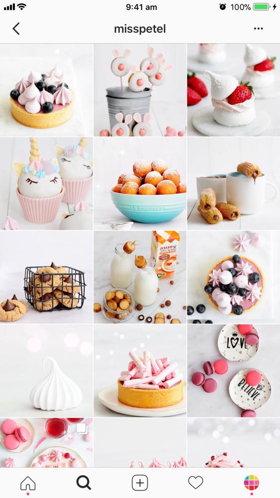
Here are some examples:
Tips
Filter: Try the White Filter Packs in Preview app. These filters are good to make a bright, clean, white Instagram feed.
Background: Don’t want a white background? It’s okay. Just make sure the background is the same in almost all of your photos. It will help people see your food better (the star of the show). Good background = less distraction = better looking food Instagram account.
Idea #2. Dark and Moody
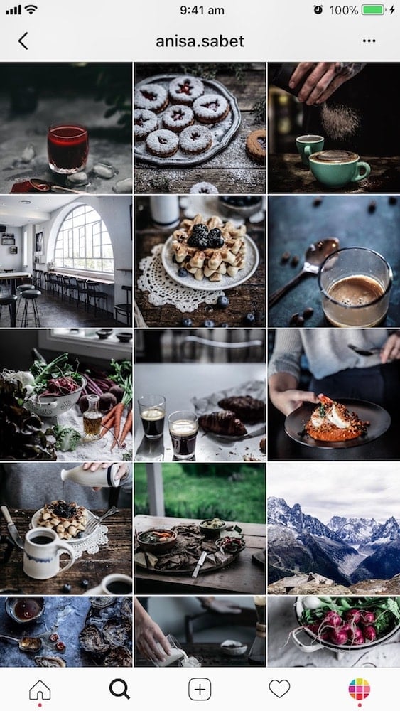
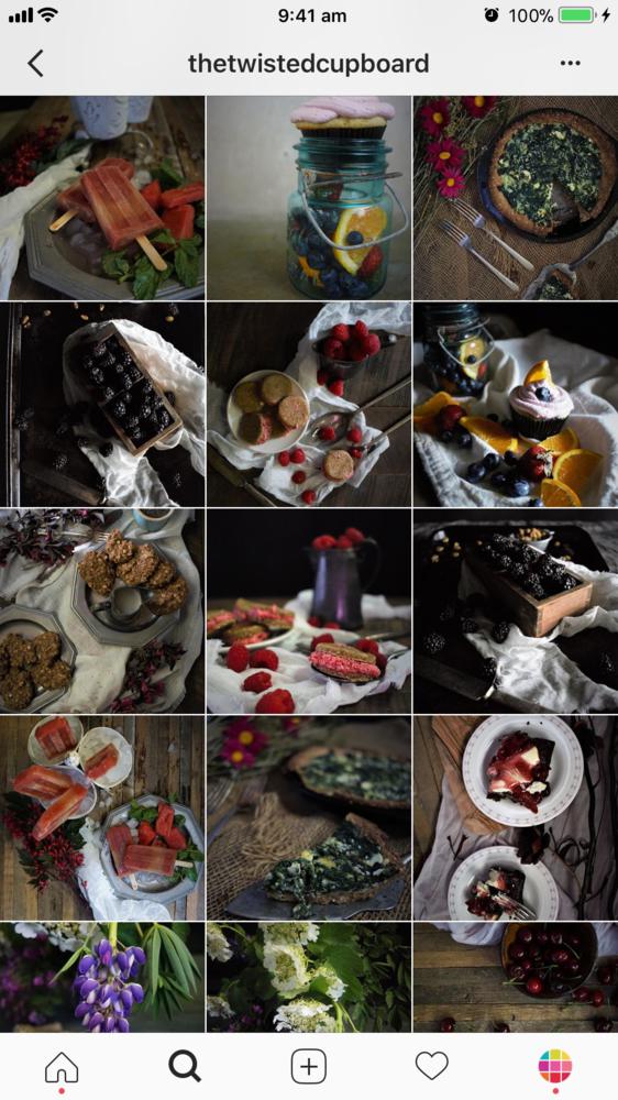
If you don’t like a white Instagram feed for your food account, try a dark / moody one.
It’s also a very popular food Instagram style in the community.
It is mysterious and captivating.
What to pay attention to:
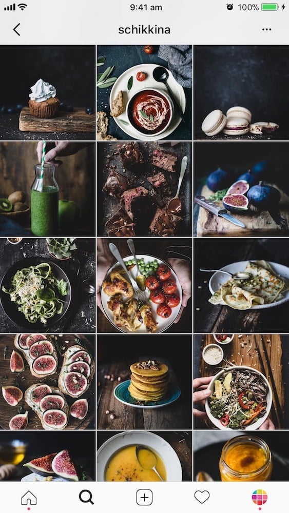
- Take your photos against a dark / black background
- Play with texture (like tablecloths, spilled ingredients, flowers or leaves on the table)
- Play with light to create depth (natural light is extremely important)
Here are some examples:
Tips
Filters: Use filters in the Dark or Moody Filter Pack for a deep, dark look.
If your photos are already dark enough and you just want to bring out the colors, try the Colorful Filter Pack.
Photography: Read these 2 awesome articles:
Idea #3. Make the Buzz
Don’t get me wrong! All the Instagram feeds I’m showing you are fun.
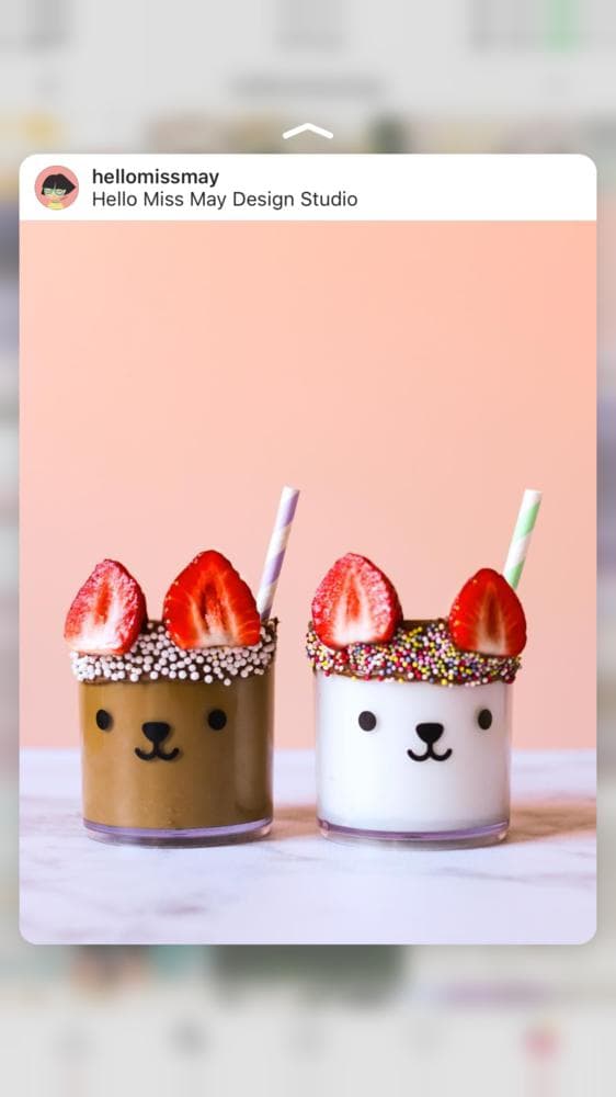
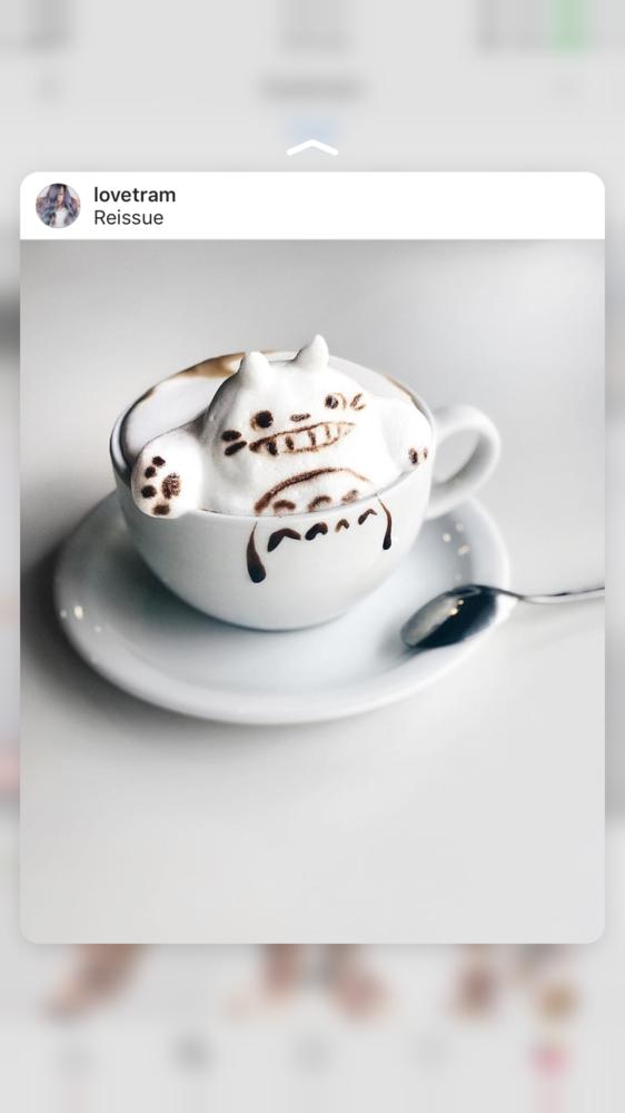
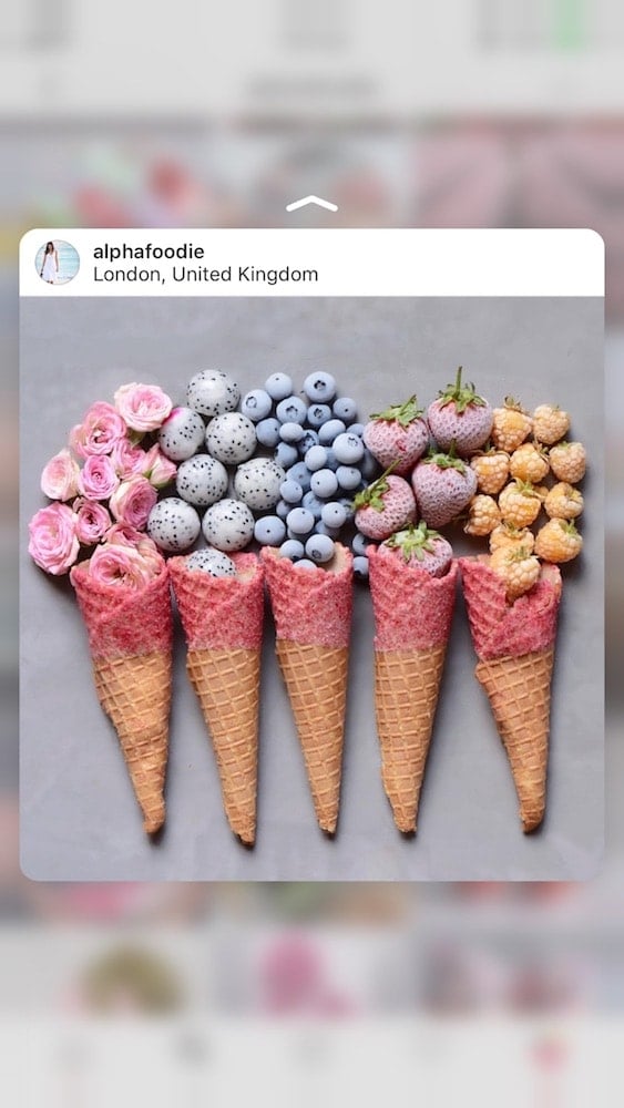
But the Instagrammers (below) play with their food and create fun things with it – they’re making the buzz. Everyone stars reposting their photos. They are becoming popular because of certain fun photos that become their “signature dish”.
When you create something “weird”, it will catch people’s attention. Think about a panda cupcake or a Darth-Vader cookie.
Some of your photos (and your account!) can go viral.
Can you make something fun and creative with your food too?
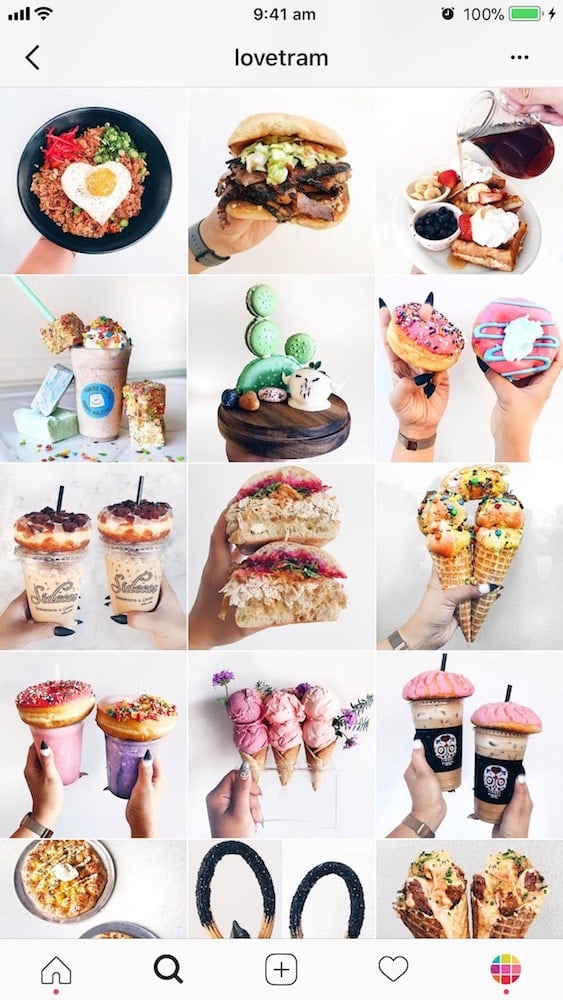
Have a look:
Tips
Not all your photos have to be like this. Try to create something fun with your food from time to time. People love things that are out of the ordinary.
Extra tip: Add a watermark on your photo with your Instagram username. This way people will know your account if your photo gets reposted everywhere.
Idea #4. Color coordinate
A lot of food Instagram feeds also love to color coordinate.
What is a color coordinated feed?
A color-coordinated feed happens when you use the same colors, all the time, in almost all your photos.
These colors become your signature.
It means that people can recognize your account by just seeing one of your photos.
They recognize the color combination you always use in your photos.
This feed idea is a great if you are taking photos of the same kind of food all the time:
- Same packaging
- Same (or similar) food
- Same food color
- Same background
Here are some examples:
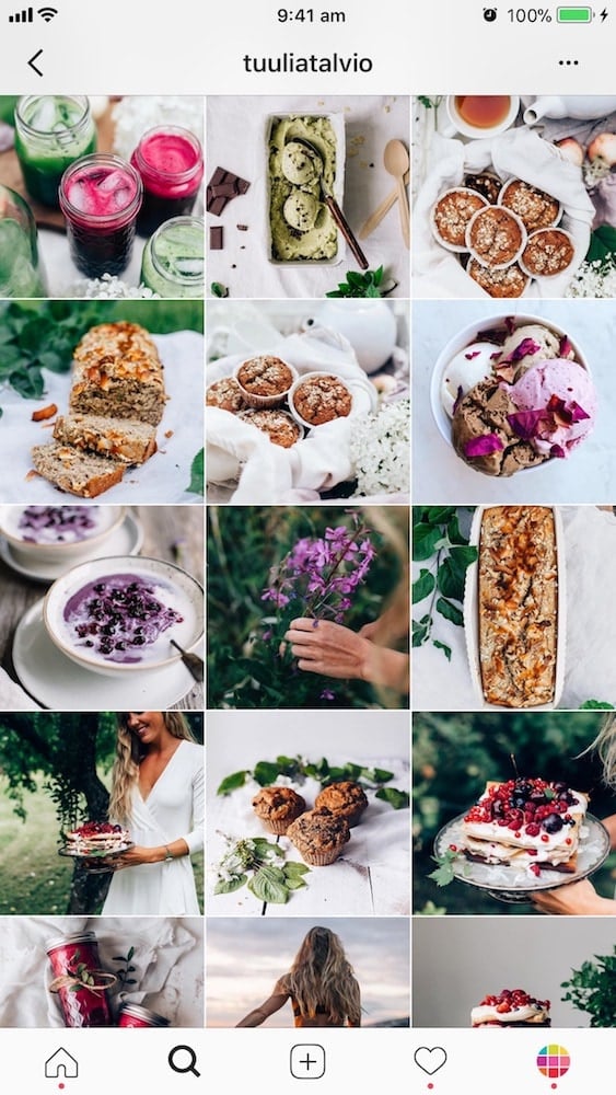
- @misspetel: Always a white background and always a pop of pink. Other colors that sometimes pop are brown and black. But pink is the signature color.
- @tuuliatalvio: White, wood (background), green and pops of red.
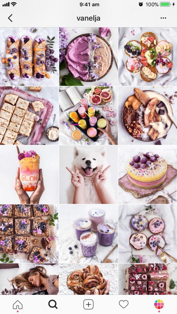
- @vanelja: Almost always white background, and pop of pink and purple (from the food, flowers or petals). The hint of purple is her signature.

Idea #5. Lifestyle
Up to now, I’ve only shown you feed that show food only.
Another feed idea is the “lifestyle” feed.
Food is the love of your life and the main topic of your Instagram feed.
But you also want to show other sides of your life. So the lifestyle feed idea is perfect for you.
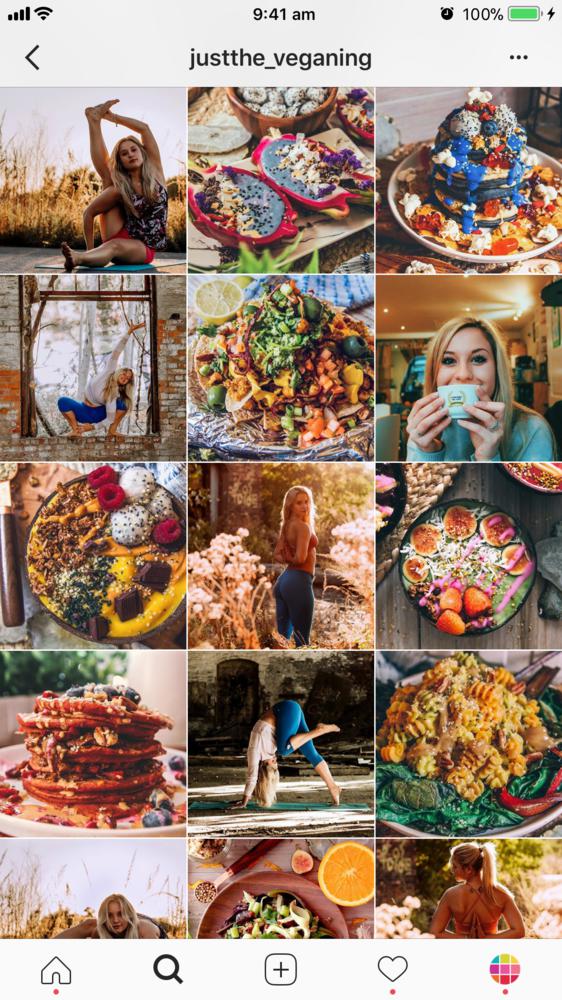
Here are examples of lifestyle accounts:
- @justthe_veganing: AnnMarie shares her food and yoga practice.
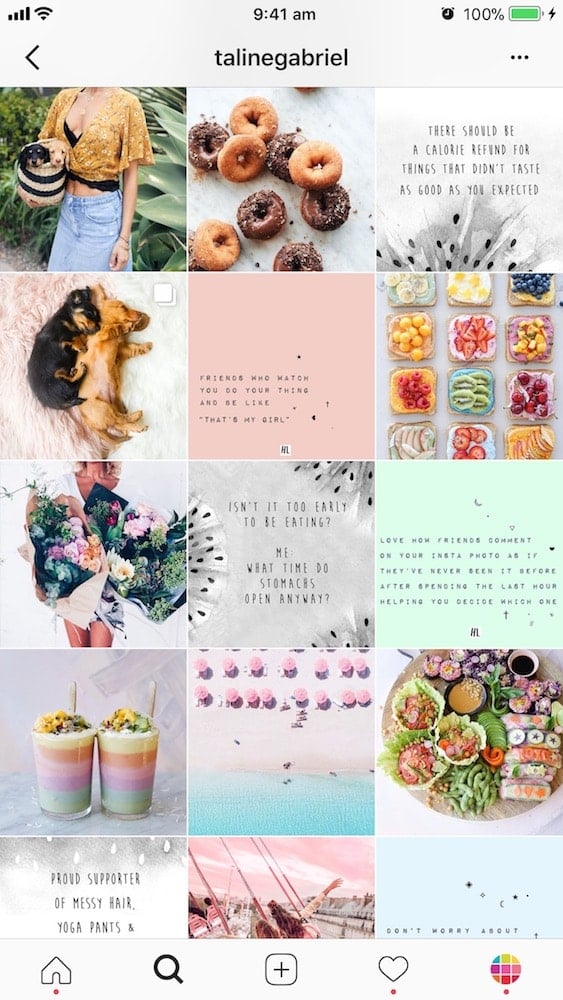
- @talinegabriel: Taline is all about food, quotes, puppies and fun things in life.
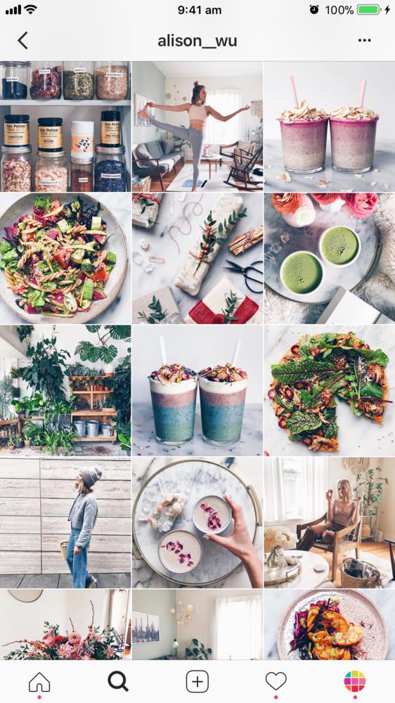
- @alison_wu: Alison shares her passion for food, wellness and lifestyle.
Idea #6. White border
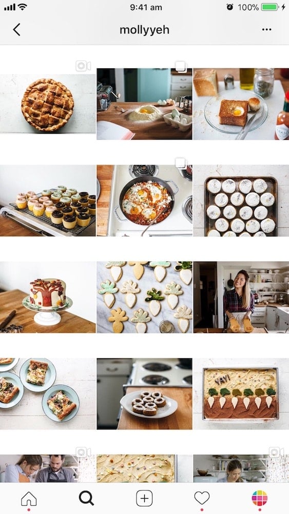
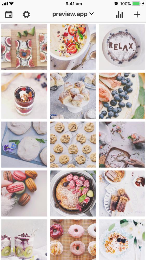
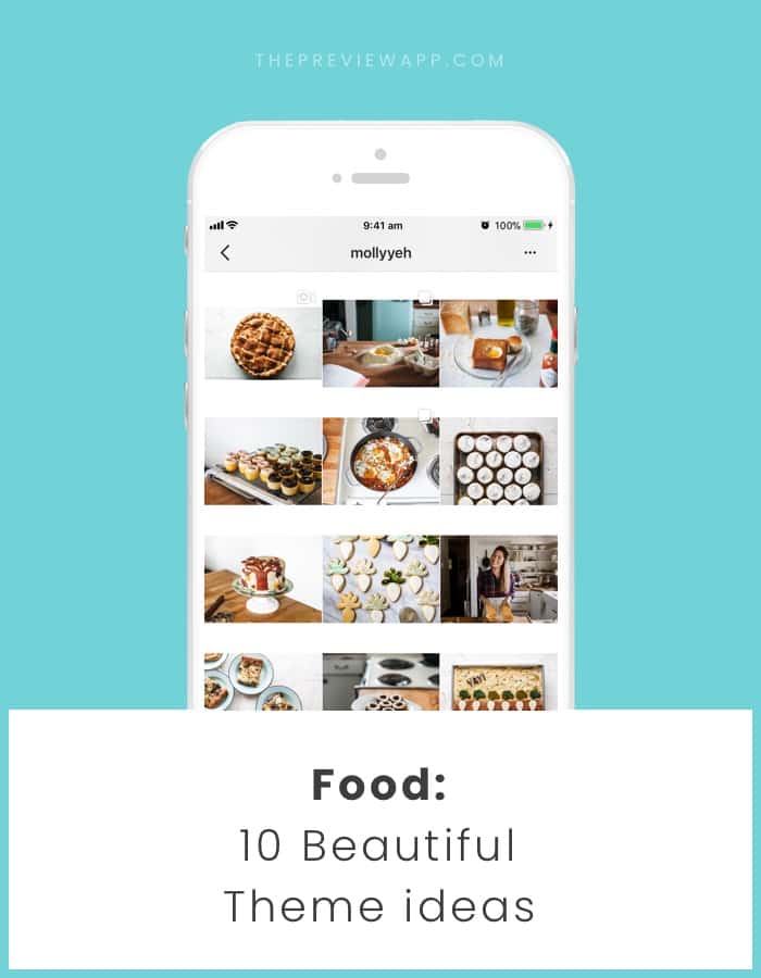
I was not able to find many food Instagram accounts using white borders (only @mollyyeh). So I made my own inside my Preview app to give you an example of what you can create (see below).
White borders are great for many reasons:
- They give space between your photos
- They make your feed look consistent instantly (even if you take photos of a lot of different things that might not be coordinated)
- Not many people use white borders for food accounts so you will stand out
Question: Why don’t many food account use white borders?
One simple answer: Many food bloggers want to be featured on big accounts. If you use a white border, your photo won’t fit with the big account’s feed. They might not want to repost your photo just because you have white border.
If that’s not an issue for you, then think about creating a feed with white borders. You’ll definitely stand out!
Tips
My favorite white borders in Preview app are: “Aura”, “Sole” and “Vela”.
Idea #7. Row by Row
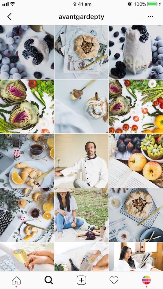
Mavi @avantgardepty is the only account I could find who does this.
She uses each “row” on Instagram to tell a different story.
If you look closely, the photos that are on the same row are related to each other.
The “Row by Row” feed design is a really creative way to show your food.
Idea #8. Colorful
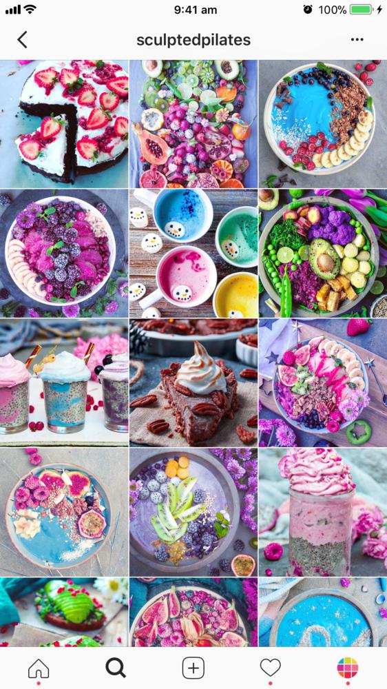
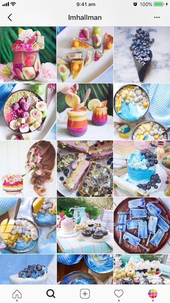
Colorful food Instagram accounts are an awesome Instagram community!
If you’re taking photos of very colorful food, you might want to make a colorful food account.
Here are some examples:
Tips
Try the Colorful Filter Packs in Preview app.
Idea #9. Perfect Height
This is more of a photography tip than a “feed idea”. But it can make ALL the difference when you’re trying to make a beautiful food Instagram feed account.
It would be a shame not to mention it.
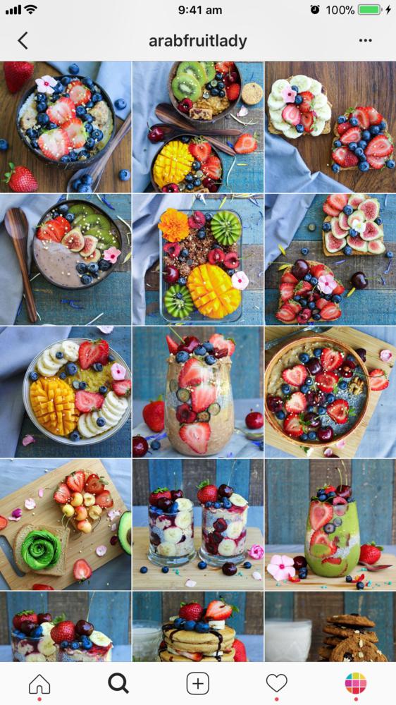
It’s something we often overlook: Do you take your photos from the same height and angles?
Take your photos from the same height.
It will make all your Instagram photos look very consistent.
Why bother?
Because Instagram is a visual platform. You want to make it as easy as possible for people to scroll through your feed and see your beautiful food.
This is a quick and easy trick to make your photos look better instantly.
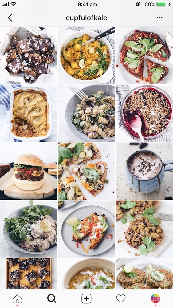
As you can see, @cupfulofkale, @arabfruitlady, @lovetram are taking almost all of their photos from the same height and angle. It makes their feed look delicious instantly!


Tips
Choose your favorite height and angles – and stick to them!
Idea #10. Minimalist or not
And the last feed idea has to do with how much “stuff” you put in your photo.
Do you like to keep it simple (minimal)? Or full of food?
Both styles are awesome and captivate our attention.
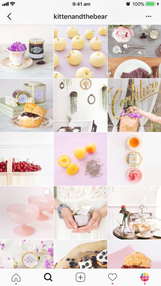
- Minimalist: @kittenandthebear
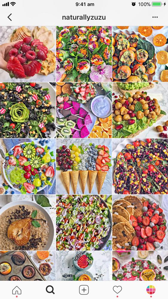
- Full of food: @naturallyzuzu
Can you see the difference?
Tips
If you are a beginner, I recommend you to make a minimalist feed. It will be easier to start. The more “stuff” you add on your table, the more you have to style the shot. Keep it simple at the beginning. Then slowly start to add your own touches and personal style (with utensils, cloths, flowers, etc…).
The magic of negative space: Leave a lot of space around your food. This is called “negative space”. It will make your feed look “minimal”.
Share your food Instagram account with us!
I hope that this article gives you a lot of ideas and inspires you!
And I really hope that you’re not feeling overwhelmed. Take your time to decide what style you want to create. There’s no rush!
Feel free to leave your Instagram account username in the comments below. I’d love to check it out 🙂
Have fun making your food feed!


I always read yor articles and tips about instagram and photography tips , i realy love your tips and i have your app on my phone to help me reach my goal and it is great! i would realy appreciate your feedback and comment about my page maybe you could help me make it better and get mor eattention to it : check it out it is : annacookingconcept
https://www.instagram.com/annacookingconcept/
Great tips!!!! thanks very much 🙂 My instagram is urquharteatery, would
love if you checked it out!! ❤️❤️❤️
Just checked it out! You are so creative! How do you even create these beautiful patterns on top of your smoothie bowls? ????
haha aw thank you!! And it’s easier than it looks 🙂 xxx
Love love love these tips!! Great article. My Instagram is @natalyahardan ! Let me know what you think!!
Your feed is so beautiful and consistent! It makes me crave chocolate because of the brown vibes going on at the moment!
My feed is @healthylittlecravings and I’m making my transition to minimalism! 🙂
Thanks for sharing:-) My Instagram is bagvrk.dk I share photos primarily of bread and cakes, but also other food and a few personal photos to let my followers get to know me. I love, when my followers tag me, because they have tried out my recipes, but I find it difficult to repost them, because their look rarely matches mine. How do I get around that?
Alexandra, could you take a look at my account as well, please? 🙂 https://www.instagram.com/bagvrk.dk/
This was soo helpful! I am a lifestyle blogger, and I am really passionate about making my account work. I have been a bit confused whether sticking to the same stuff here, but realise now that consistency is the way to go. Thanks 🙂 If you want to check me out, it is @razzledazzlevegan on Facebook, Insta, Youtube and WordPress!
I’m so glad you found it useful! Yes consistency is everything on Instagram 🙂 it’s so simple but it literally make your photos stand out. By the way, just checked out your account! That chocolate porridge looks SO good!
I am definitely going to start thinking more about that! It looks good, right?! I have a template for it, but usually change it up slightly 😀 chocolate for breakfast is just amazing!
Hello ! Thanks very much for sharing these tips. I have recently thought a lot and wonder why it doesn’t work that much for me on IG … despite of all the efforts I make on my food photography. May be , probably, my feed doesn’t look good enough and people don’t find it attractive… Can someone please tell me some sincere feedbacks please ? My name is @steve__ho I am ready to hear the truth LOL
Hello! Love the great tips! I’m mor of an neutral grey color and I’m working hard to get to that mood! I have a food blog called the healthy sins (you can my IG @thehealthysins) and my fream is to become a food photographer and be an inspiration in food photography! Tell me what you think about my feed it would be great to have an opinion! Thank you a lot in advance 🙂
@vxdollface
I like my photos but I feel like my feed is looking cluttered, especially on mobile devices. My Instagram is https://www.instagram.com/a_plant_based_trainer/. Any suggestions would be so so appreciated!
I am just starting out with @scrumptiliumptious. Thanks so much for this post! I gotta work on mine but not sure which way to go as I’m covering my homemade stuff asking with where I eat… Restaurants use so many different styles and colors I’m having a hard time figuring out how to be consistent. Any advice?
Hello, thanks for the information.. we started a new blog a month back and struggling for new followers.. can you please have a look:
http://Www.instagram.com/fussyfoodbloggers
Great tips! I will try to implement these. I just recently started an account @meatavegan. Let me know what you think please!
Your tips are amazing and I am gonna try to incorporate them into my account too. Do give a check to my account @the_food_fella
Love this article, loads of useful information! @defyinghangry
Loved the article and the accounts you added! Thanks 😀
I’m a food blogger in Dubai (i like to call myself a ‘baby blogger’ for now!) and my account is @food_havelli please let me know if you have any feedback for my account, would love to hear suggestions from you! 🙂
Hi All! Love your article btw 🙂
I am new on Instagram, I am still a bit confused about my page, trying to figure this out!
I would love to have your opinion. Go check it out https://www.instagram.com/k.kitchen.jungle/
Hi my name is James I have an instagrame food account literally only just started and would love some insight into how I can create a nicer more appealing layout. Its @sar_bhia on Instagram
Thanks
Mine is @foodieshe
Would love if you check it out!
Hey there! Thanks for the great article @thepreviewapp:disqus !
My food instagram account is @cyfoodgram , if you can have a look and let me know what you think I would really appreciate it! 🙂
Thanks https://instagram.com/munchingnerds?igshid=1nikfznyd3q2n
@munchingnerds
thanks 🙂 My Instagram is https://www.instagram.com/foodiemahima/