
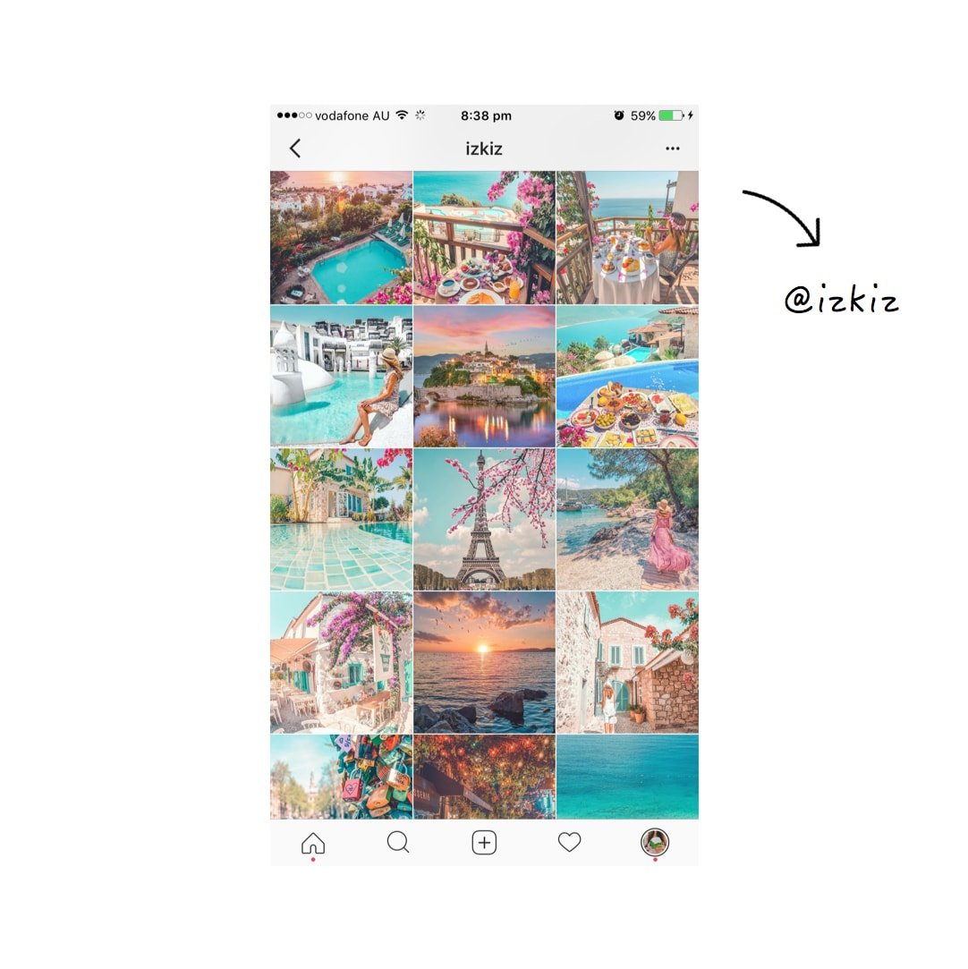
Hello everyone! Last week I shared this Instagram theme and you LOVED it!
I was inspired by the talented @izkiz. She seems to professionally edit her photos on her computer using Lightroom. I thought it would be so much fun to show you how I create my own colorful bright Instagram theme using only Preview App and its filters.
As usual, I’m going to walk you through my 5 steps to create an Instagram theme. It’s the easiest way to make your Instagram feed look beautiful.
Let’s start!
PS: If you’re new around here, make sure you have Preview App on your phone so you can follow the tutorial with me.
1. Pick the right colors and photos
If you want a colorful theme, you have to use colorful photos. This will ensure you get the best effect when you look at your theme as a whole.
Make sure you use photos that have a lot of different colors.
Can you see what main colors @izkiz uses for her theme?
- Blue: the ocean, water and sky
- Pink: flowers, cars, food
- Green: plants
- Orange: from sunsets
These are the 3 main pops of colors that I will use in my photos. This is how I will keep my theme look consistent.
Of course, you can use a LOT of different colors. The more colors you use in your photos, the more colorful your theme will be. But if you want an Instagram feed like @izkiz, stick to these 4 main colors.
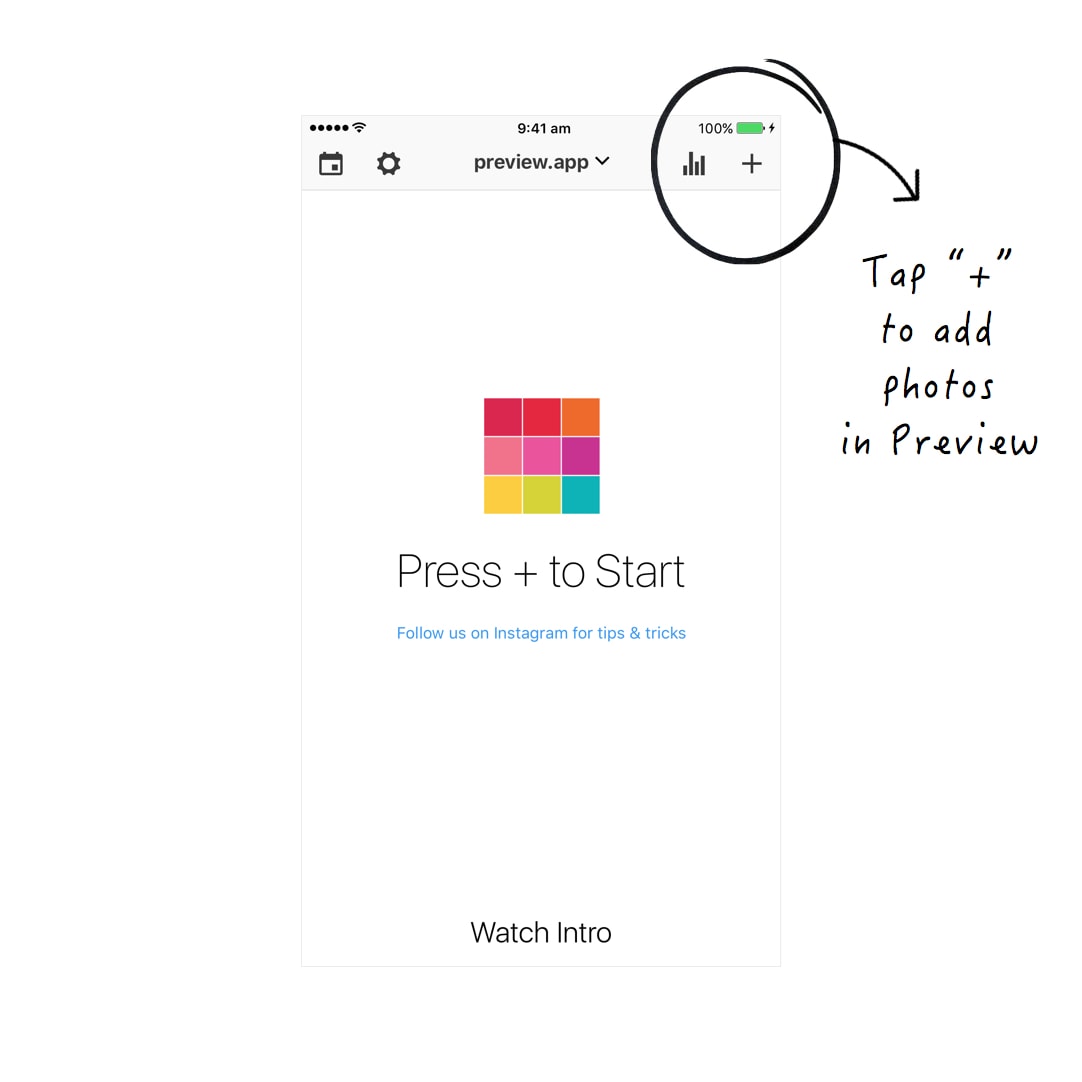
2. Add your photos in Preview App
Do you have your photos ready?
Add them in your Preview App, and let’s start designing the feed.
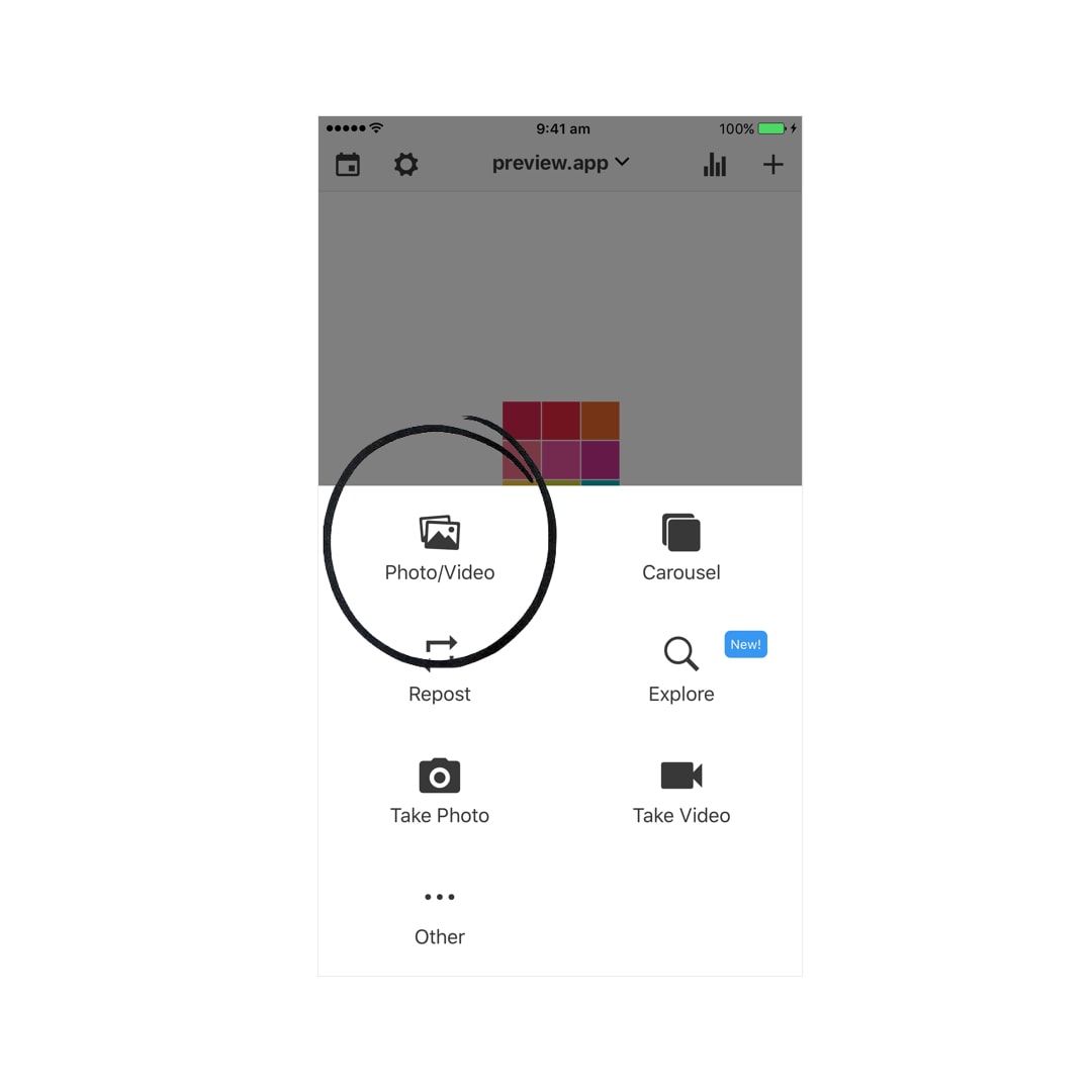
Tap on the “+” button to add your photos in Preview.
All your photos will be added in your Preview feed.
As you can see below, I’m using photos that are less “crowded” than @izkiz.
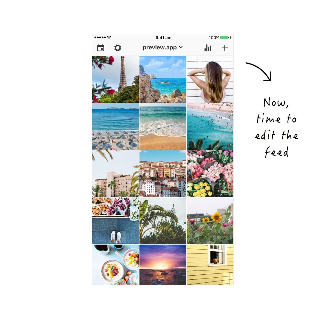
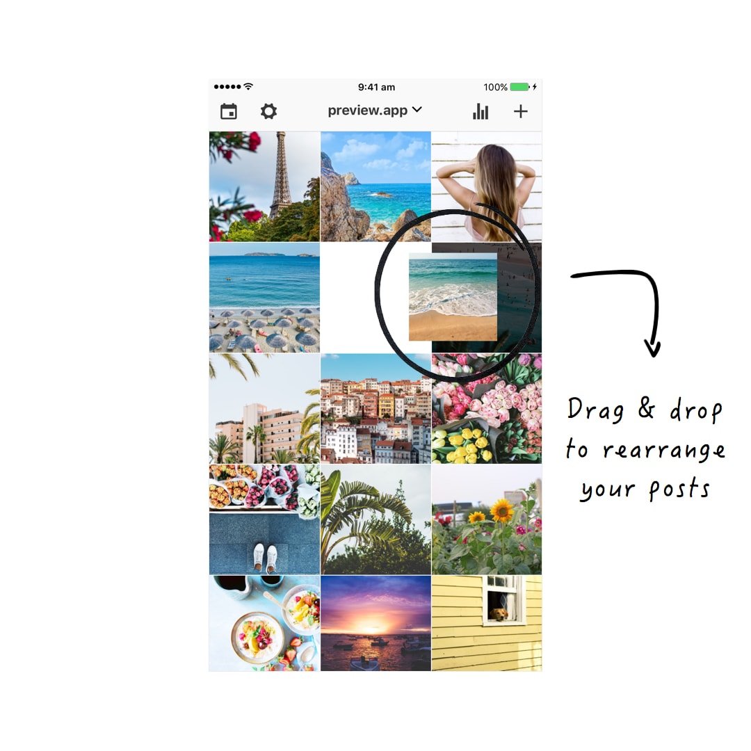
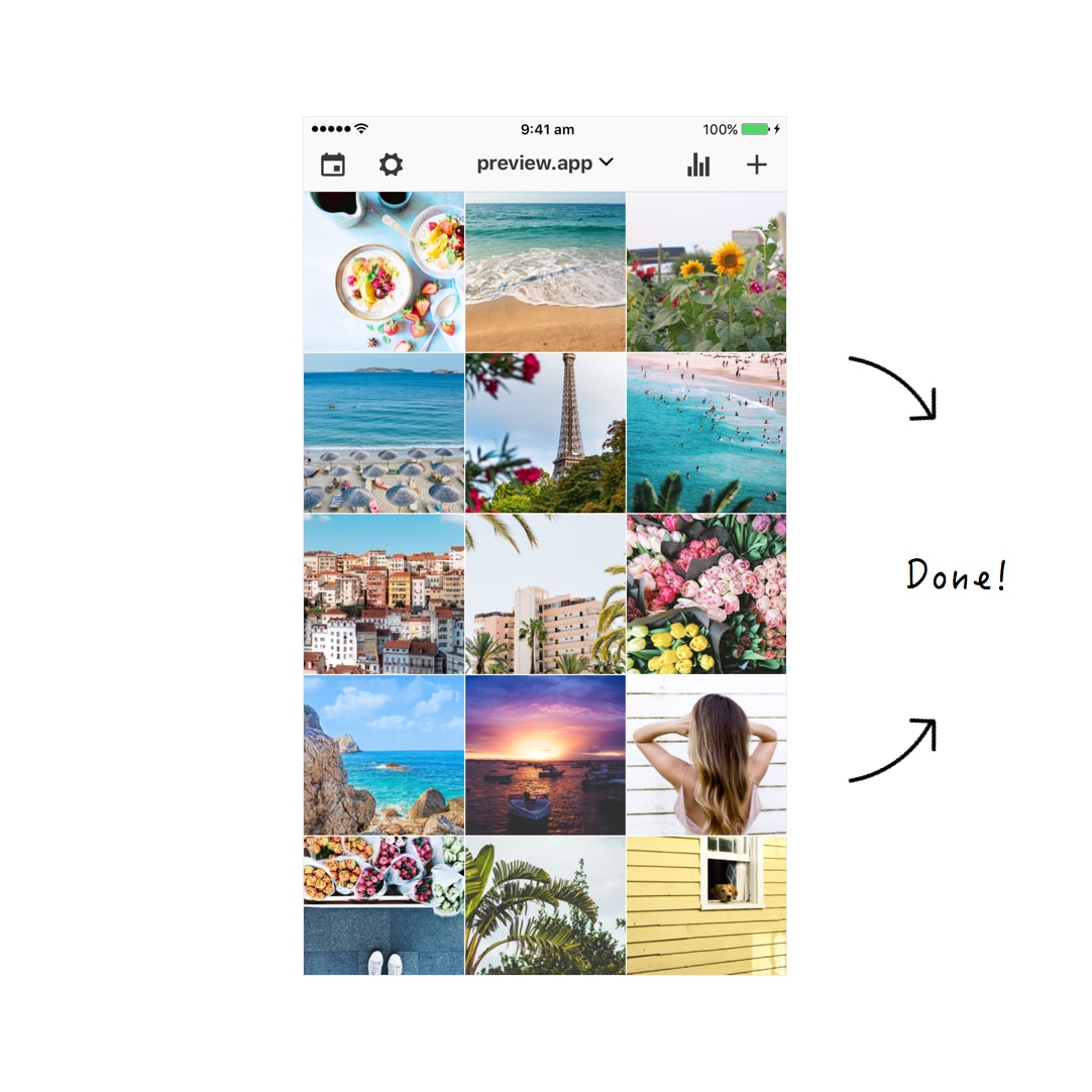
3. Rearrange your photos to make your feed look balanced
A theme is all about how your feed looks like overall. That’s why people click on that “follow” button. Think about your Instagram feed as your magazine. You want it to look good. If it looks good people will want follow along J
Now, how can you rearrange photos to make your feed look good?
It’s all about BALANCE.
I always separate photos. For example, I don’t put all the “blue” photos (the ocean photos) next to each other. I space them out.
If you are interested in how to rearrange photos to make a theme, read this article.
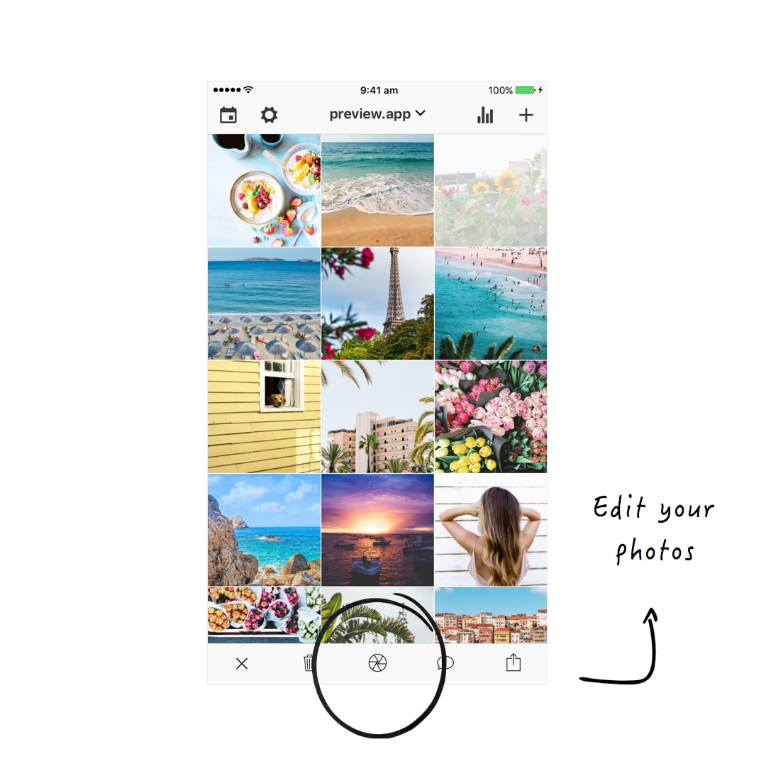
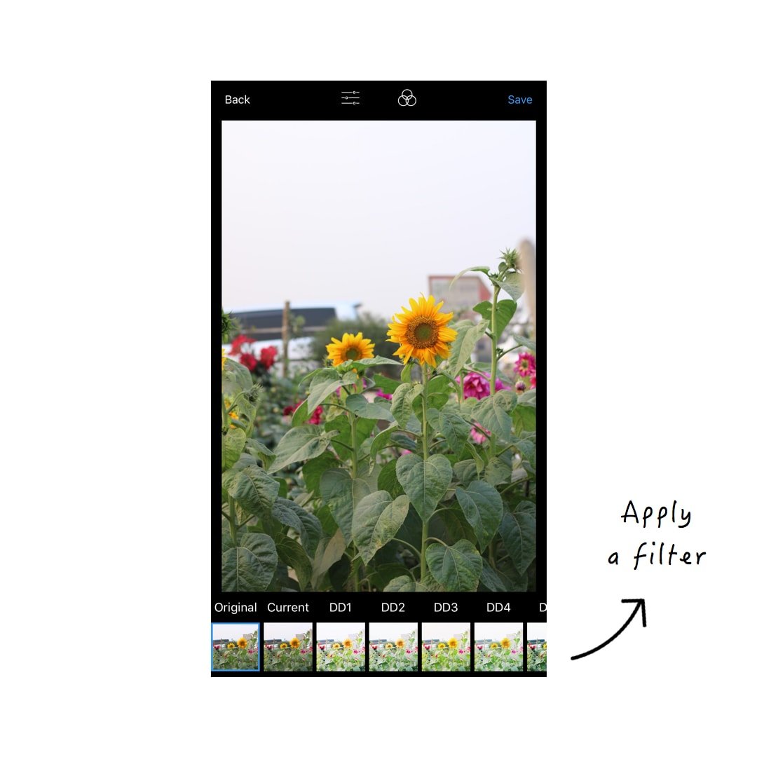
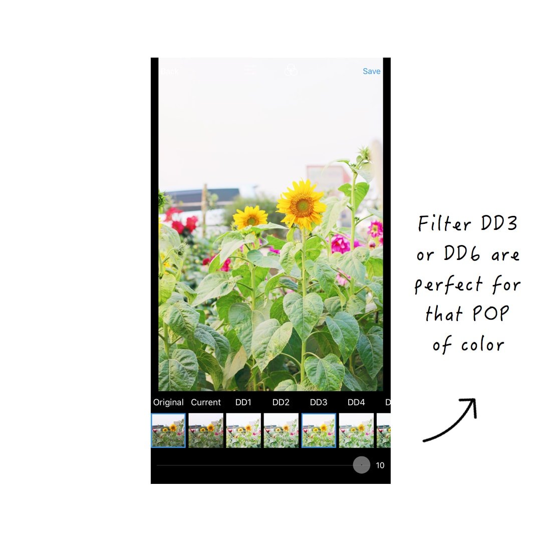
4. Apply a bright colorful filter
Now you need the colors in your photos to POP! You want them to be bright!
My favorite filters for a bright and colorful look are in the White II filter pack (DD filters).
For this theme, I’m going to use filter DD3 and DD6. Both are amazing for that POP of color. I also love how they make the color of the water aqua / turquoise. It’s beautiful!
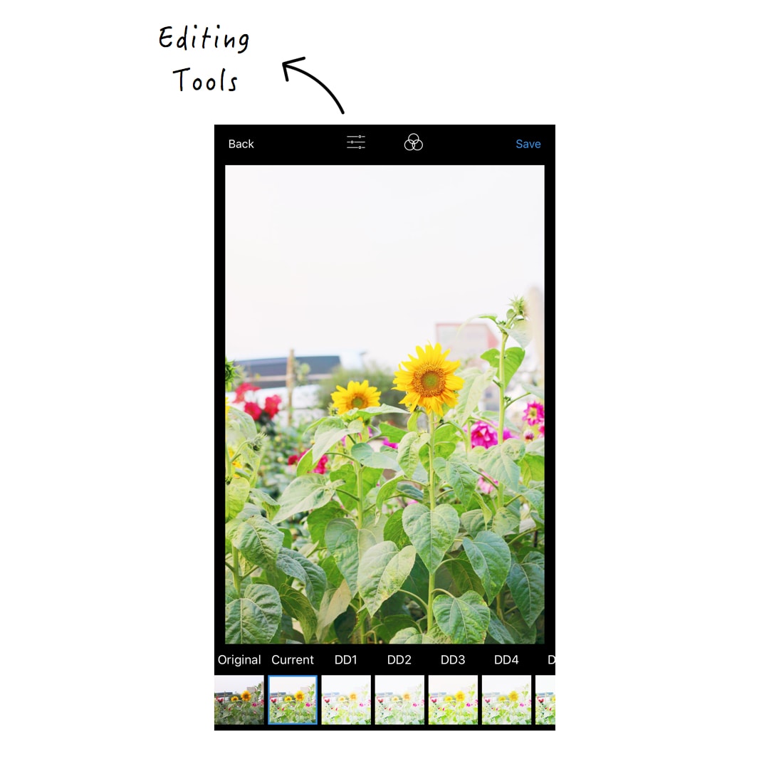
5. Final touches for that summer glow
I could leave the photos like that. But as you can see, @izkiz has that warm vibe going on. The photos also looks very peaceful.
So I’m going to add just a little bit of warmth for that SUMMER GLOW. And do 2 more edits.
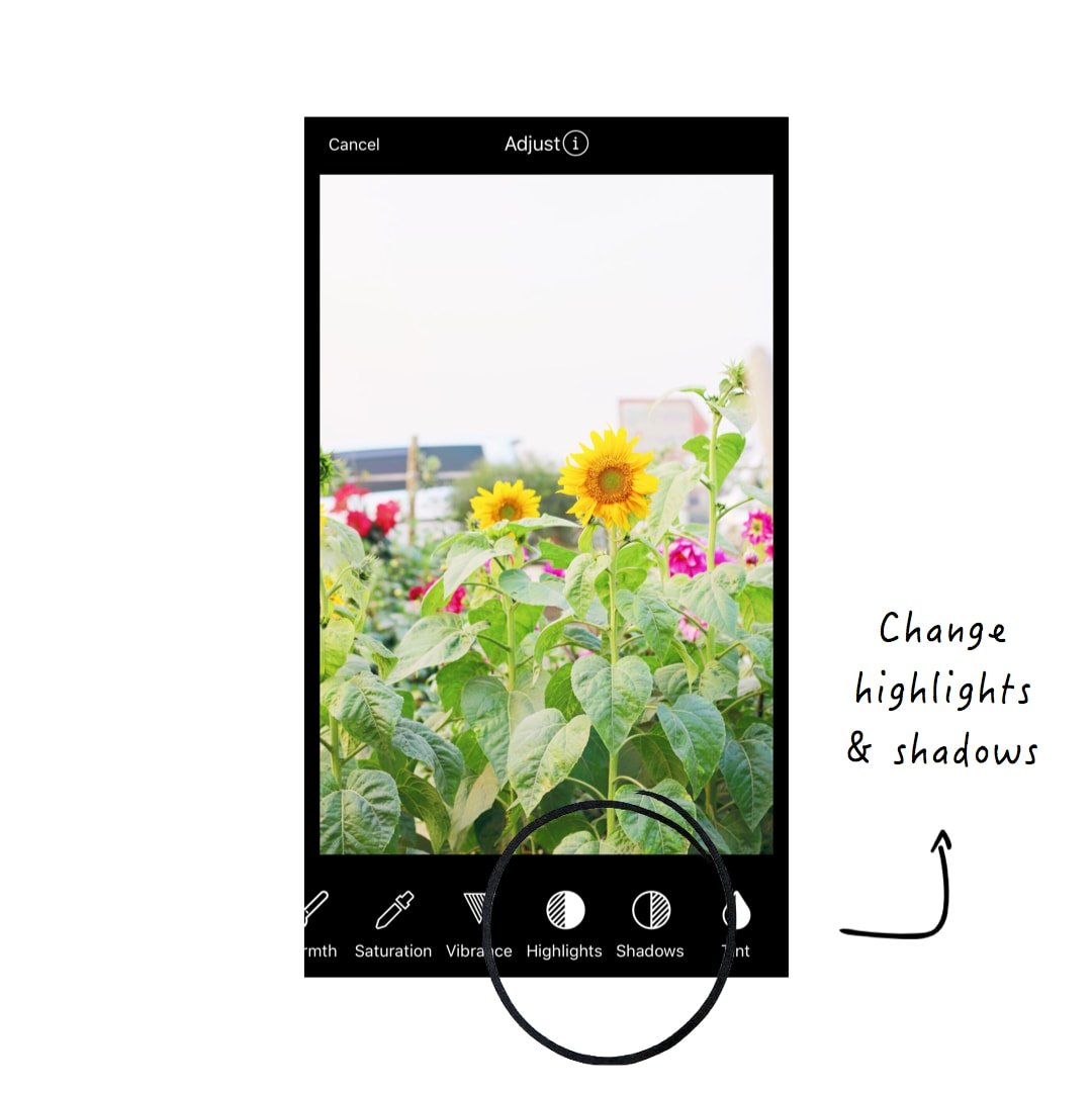
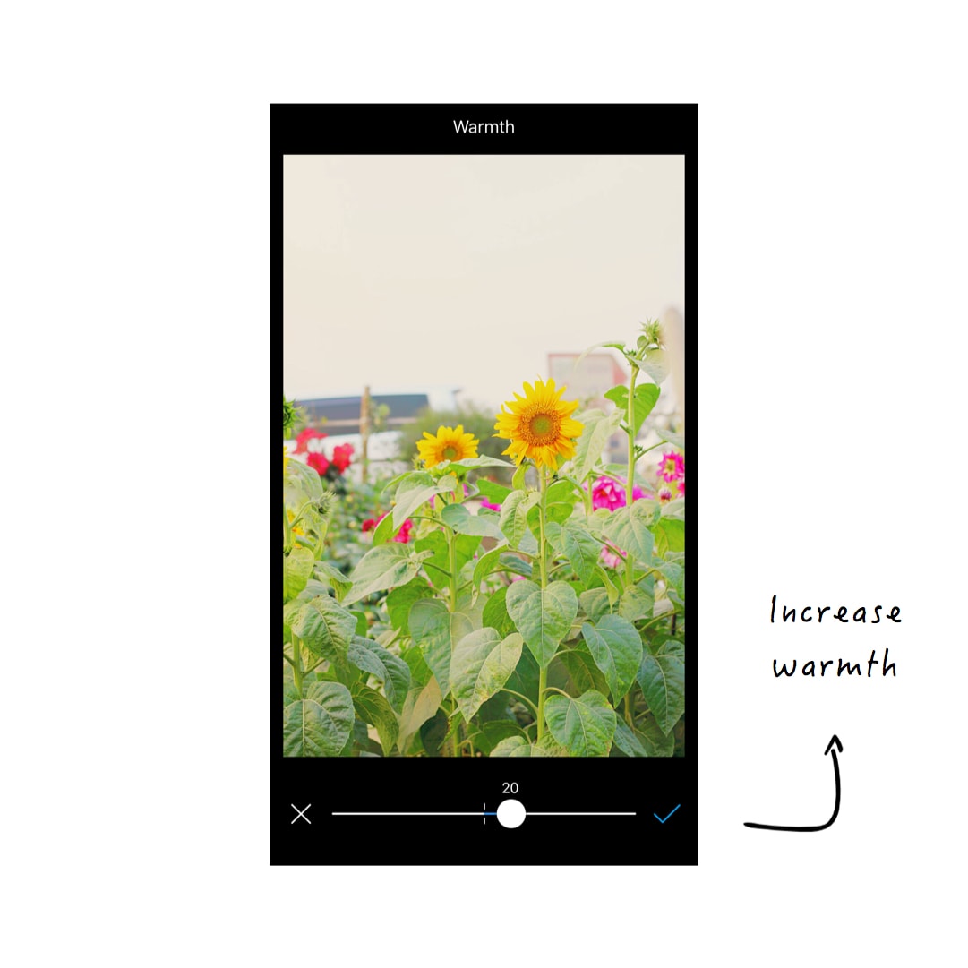
To add warmth in your photo:
- Go in the Editing Tools
- Increase warmth (between +10-20)
- Decrease highlights (-100)
- Increase shadows (+30)
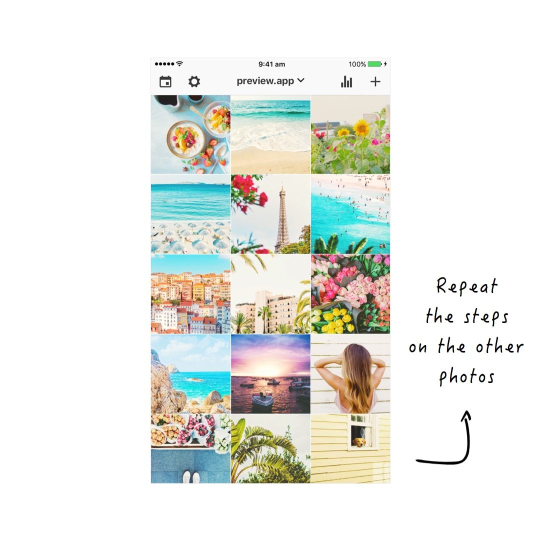
Repeat this process on other photos, and you are done!
Do you like it?
I hope you’ve enjoyed watching me edit this theme. I love the bright, colorful summer feels!
What theme would you like me to do next? Tell me in the comments.
Until next time, see you all on Instagram (@preview.app) for more Instagram tips, tricks and theme ideas.
+400,000 Instagrammers are already using Preview App to edit, plan & schedule their feed. If you haven't tried it, you're missing out.
Can I buy that filter pack without subscribing preview app pro?
Yes you can. Press on the “Buy” button and select the first option. Send us an email at [email protected] if you need help.