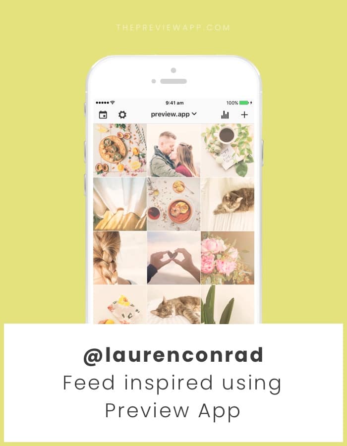
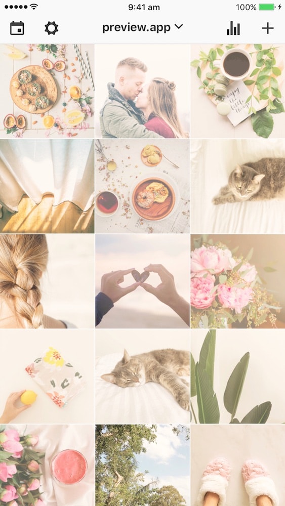
A soft, bright pastel feed with a touch of vintage vibes. I’m loving Lauren Conrad’s filter!
I’m going to show you how I create a theme like Lauren using Preview app.
It’s not just about the filter to get the perfect effect. It’s also about what photos you use to create a feed like Lauren.
As usual, I’m going to use my 5 steps to design a beautiful Instagram feed quickly.
Let’s start!
Step 1. Choose your color story
The colors in your photos are one of the most important ingredients when you design an Instagram theme – more important than choosing a filter.
If you don’t have the right colors, your photos will clash with your filter.
The colors you choose are your story. They create the entire vibes of your feed – before you even apply a filter!
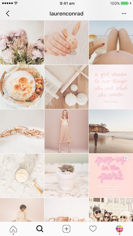
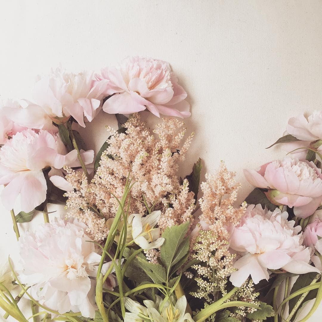
Lauren Conrad has a very light, soft and bright Instagram feed.
She mostly uses these colors in her photos:
- Peach / pink / orange: skin color, flowers, outfits
- Brown: wooden furniture, hair
- White: white background, white wall, white bed sheets
- Green: plants, nature
- Black (rarely)
All the colors in her feed are very natural. That’s why it looks so peaceful.
The main color in her feed is the peach / pink / orange. That’s what makes her feed stand out and unique.
Step 2. Take the perfect photos
Now that you know what colors you need to focus on, you can take the perfect photos for your feed.
The photos you take also tell a story. If you want a soft, peaceful Instagram feed, you need to take photos of soft and peaceful things.
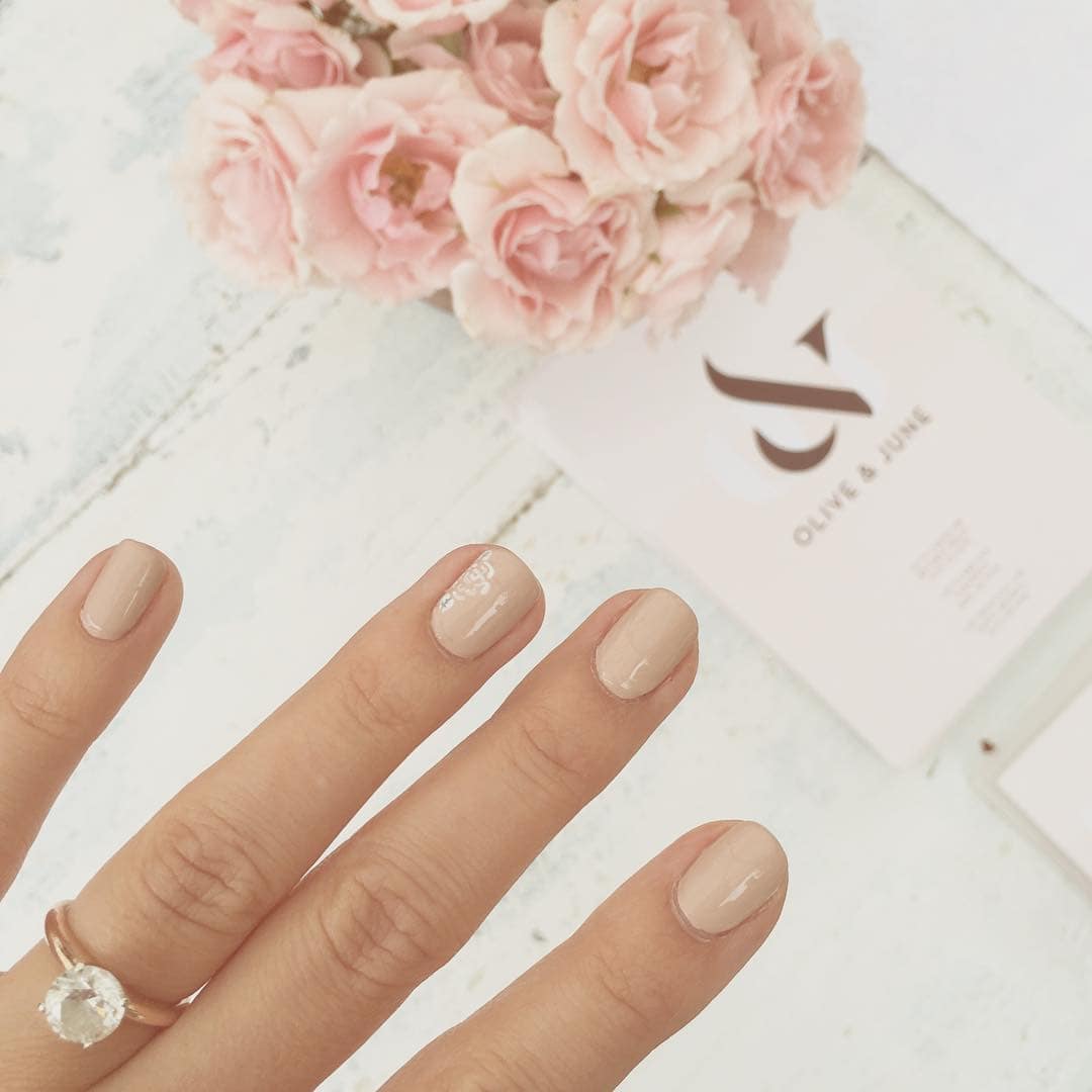
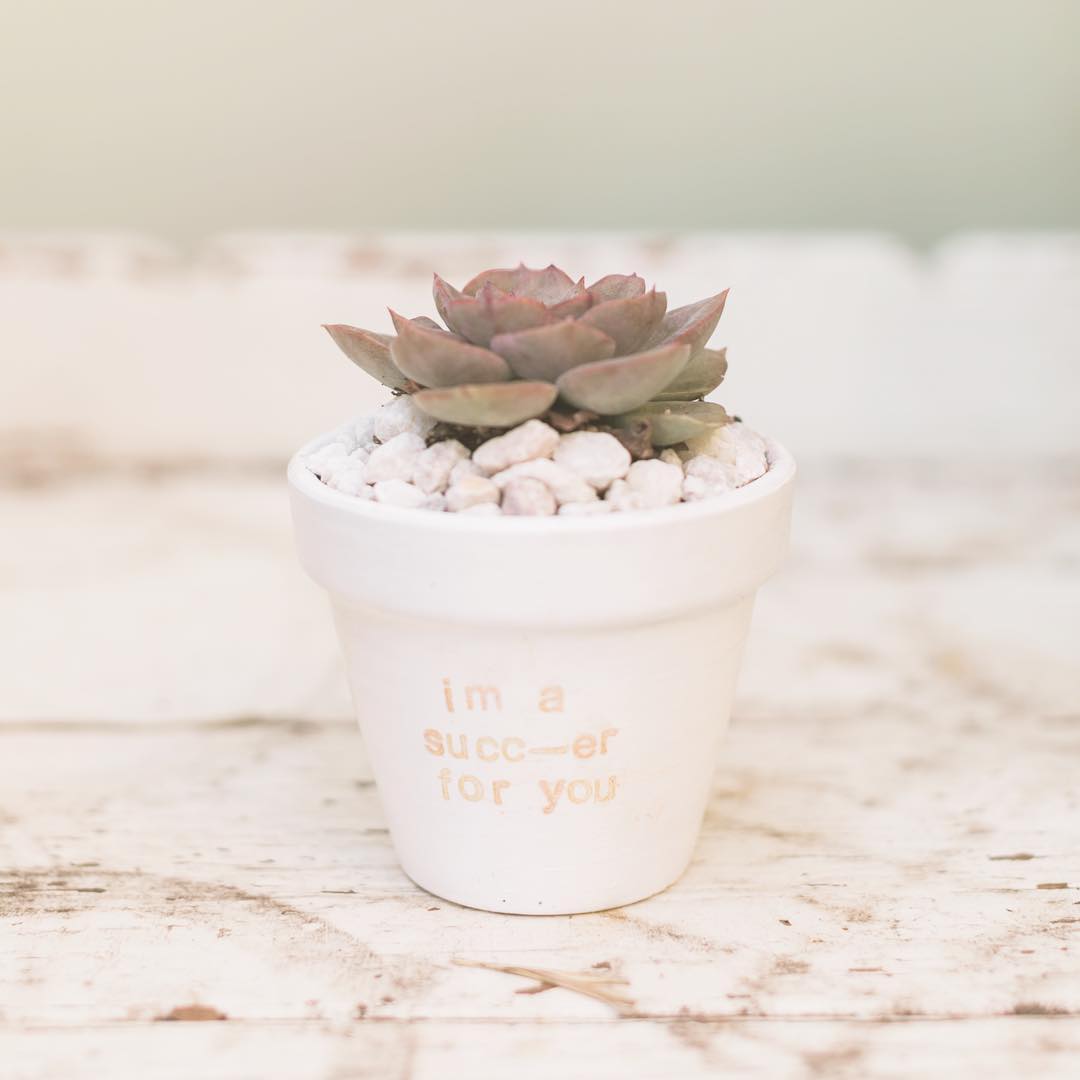
I already gave you some hints before. This is what Lauren Conrad loves to capture:
- Flowers (a lot of flowers – this is a very recurring subject in her feed which makes it very peaceful and elegant)
- Food
- Outfits
- Little things in life (family, friends and puppy)
Quick note: You can also see that Lauren takes a lot of simple, minimal photos. There’s only one or two things in the photos. The backgrounds are white and clean (no distraction). Minimal photos make a theme look peaceful.
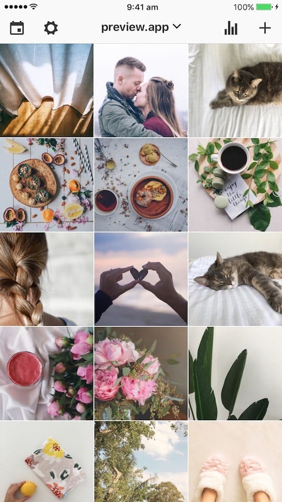
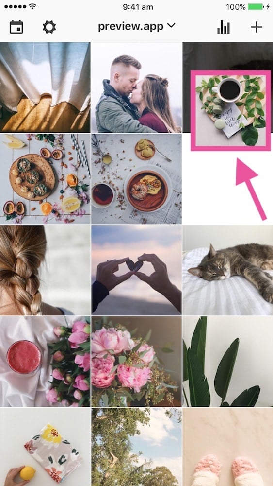
Step 3. Add your photos in Preview App
Now you know what photos to take of. You also know that you have to focus on some colors to make it all flow beautifully.
Let’s add the photos in Preview app.
If you’re new, Preview is an app to design and schedule your Instagram feed.
To add photos in Preview:
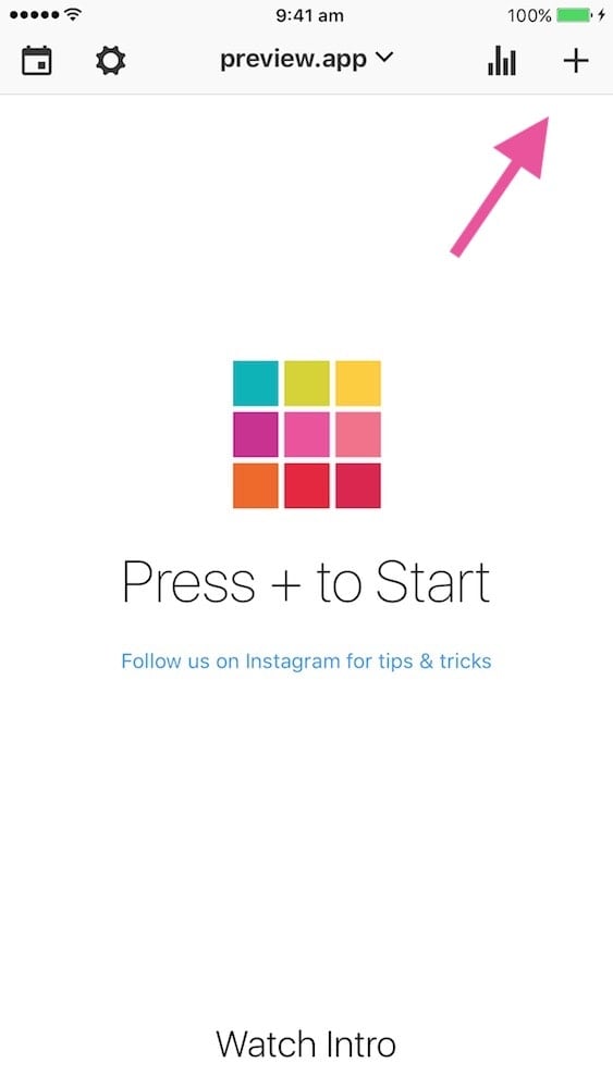
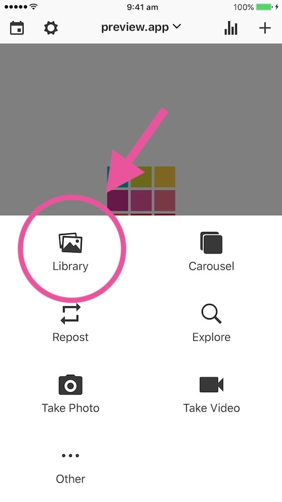
- Press the “+” button on the top right corner of your screen
- Select “Library”
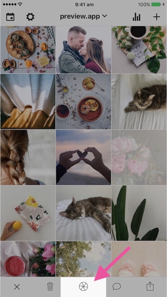
Step 4. Rearrange your photos to make your feed look balanced
Now that you have all your photos in Preview, you can rearrange their order.
If you’re like me, you might like when your feed looks lovely overall. So rearranging your posts before you post anything on Instagram is a must.
Lauren is really good at spacing her photos to create a balanced feed.
There are a few tricks you can use to know what photo to put next to each other. You can read my tricks on how to rearrange photos here.
There are 3 ways you can rearrange photos in Preview.
For now, just drag and drop the images to move them around.
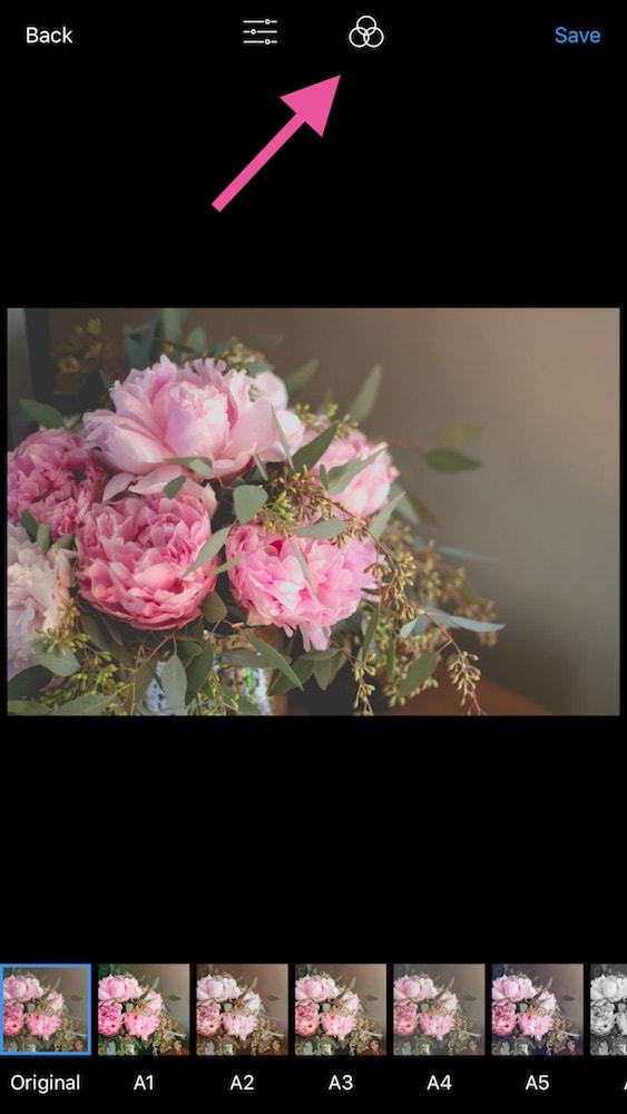
Step 5. Apply the “Lauren Conrad” filter
Once you’re happy with the flow of your feed, you can apply a filter.
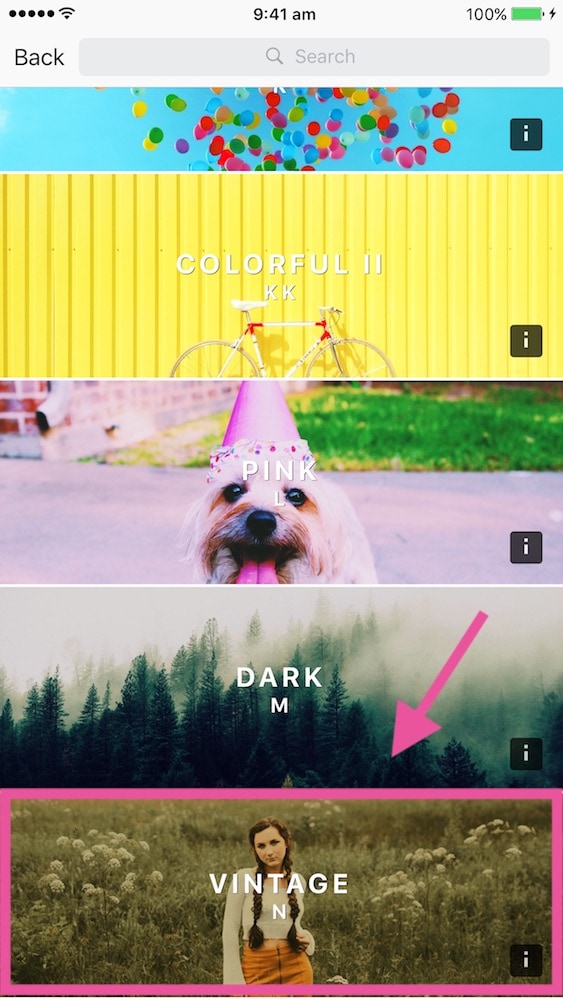
The filter I love to use for a similar effect is N7 in the Vintage Filter Pack.
N7 is the brightest vintage filter in the pack.
It has soft, pink-ish tones that reminds me of Lauren Conrad’s filter.
This is how to find the filter in Preview:
Apply filter N7 on all your photos:
Tada! You’re done!
If you want to change the exposure, contrast, etc… you can edit your photos with the editing tools in Preview.
If you need more help designing your feed, download our Instagram Guide. I share all my tips in there to create a cohesive feed:
Complete Guide: How to Create a Cohesive Instagram Feed
Have fun!
+400,000 Instagrammers are already using Preview App to edit, plan & schedule their feed. If you haven't tried it, you're missing out.