Hello Instagram lovers! Ready for some inspiration?
Let’s do this.
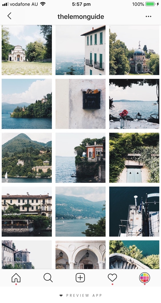
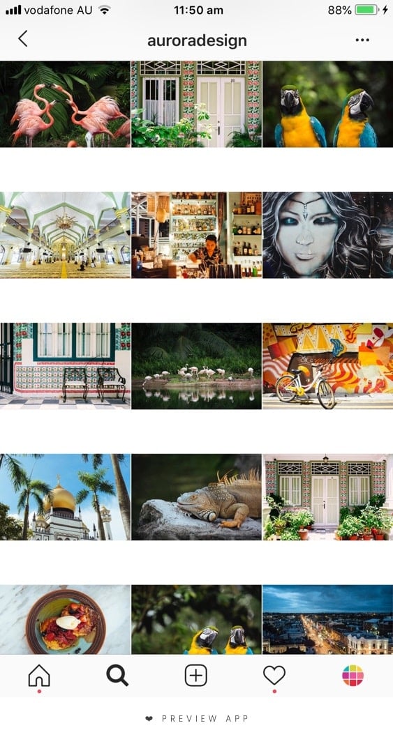
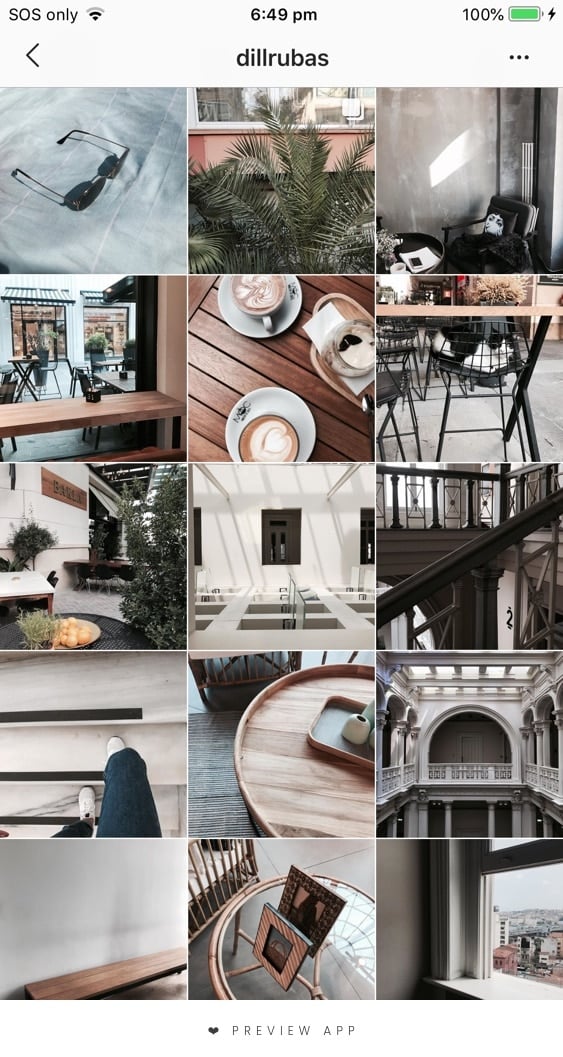
This blog post post is for you if you don’t know where to start, how to plan our feed and how to achieve a consistent theme, or you just if you need inspiration because you want to change your Instagram feed.
There are so many different Instagram themes you can create: borders or no borders, bright or dark, puzzle or rainbow? So many choices, so much fun. Which one will YOU choose?
Remember, your Instagram theme is a reflection of who you are and what you love. Don’t feel like you have to stick to “rules”. There are no rules. You make your own rules. The secret to making a beautiful theme is to love what you share and stick to your style.
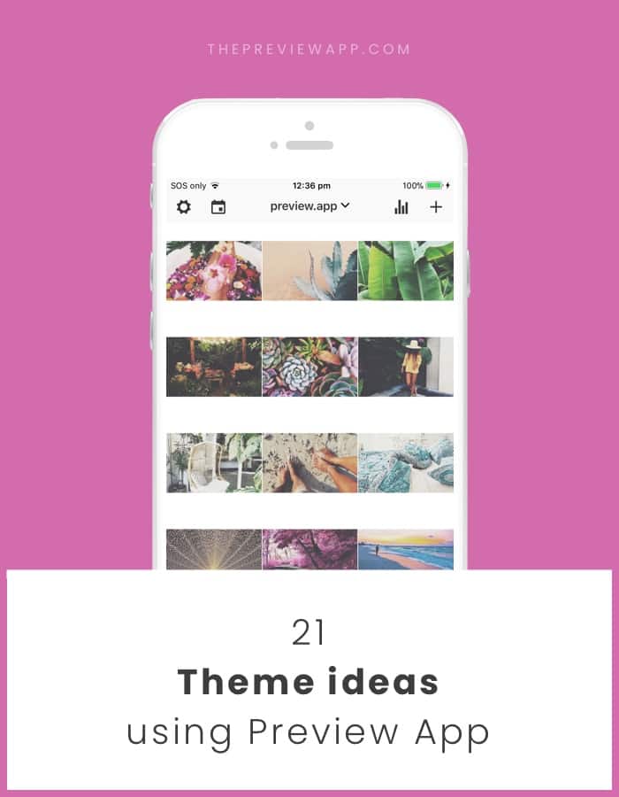
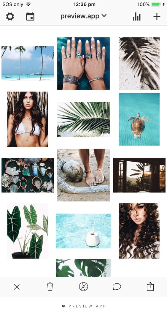
Quick tip: You can use Preview App to design your Instagram feed. With this app you can plan your feed in advance, edit your photos, schedule your posts, find hashtags, etc… If you don’t have Preview yet, you can download it here.
Before we start, I need to give a BIG SHOUTOUT to our awesome Preview community because 99% of the feeds you will see are made by them, using the app. Thanks for sharing your feed for this blog post guys!
Enough talking. Here are 20 beautiful Instagram theme ideas and inspirational accounts.
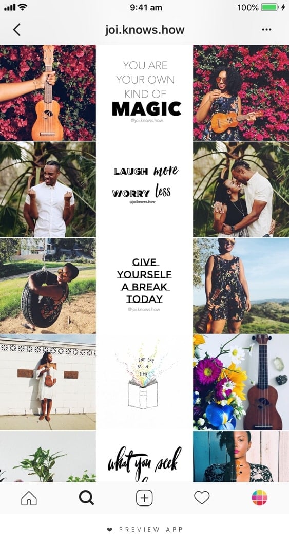
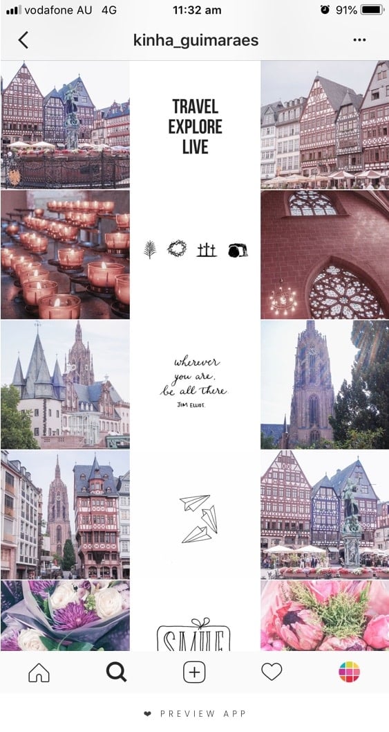
1. Line in the middle theme
The Line in the Middle is usually made of quotes on a white background. However the Line in the Middle can be another color or any other theme you want. The line will guide your viewers as they scroll.
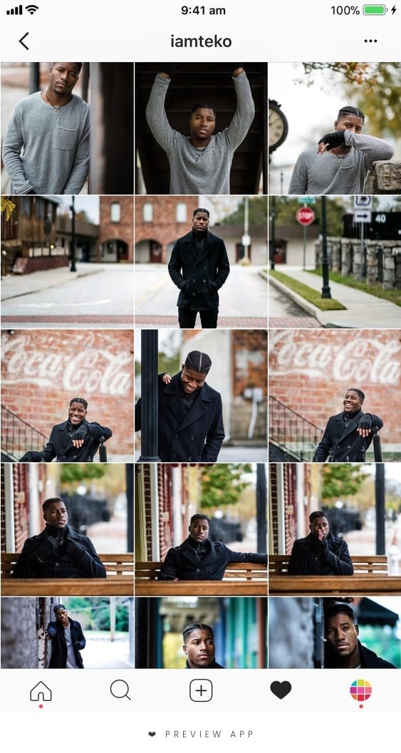
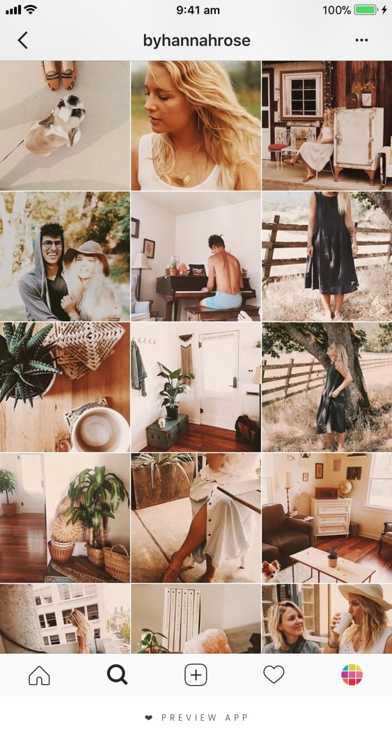
2. Row theme
This layout looks like you are reading a magazine. You can get very creative and tell a story, row by row. For example, @iamteko uses one row to share photos related to one photo shoot or outfit.
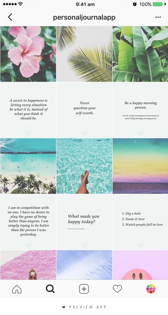
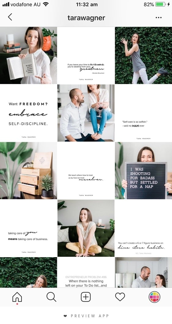
3. Tiles theme
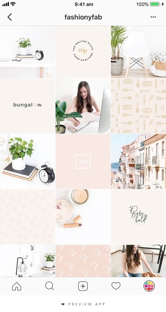
The most popular way to use the tiles layout is by alternating between a photo and a quote (like @tarawagner). However, you can get creative. For example, you can also alternate between a photo and an example of your work, like @fashionyfab.
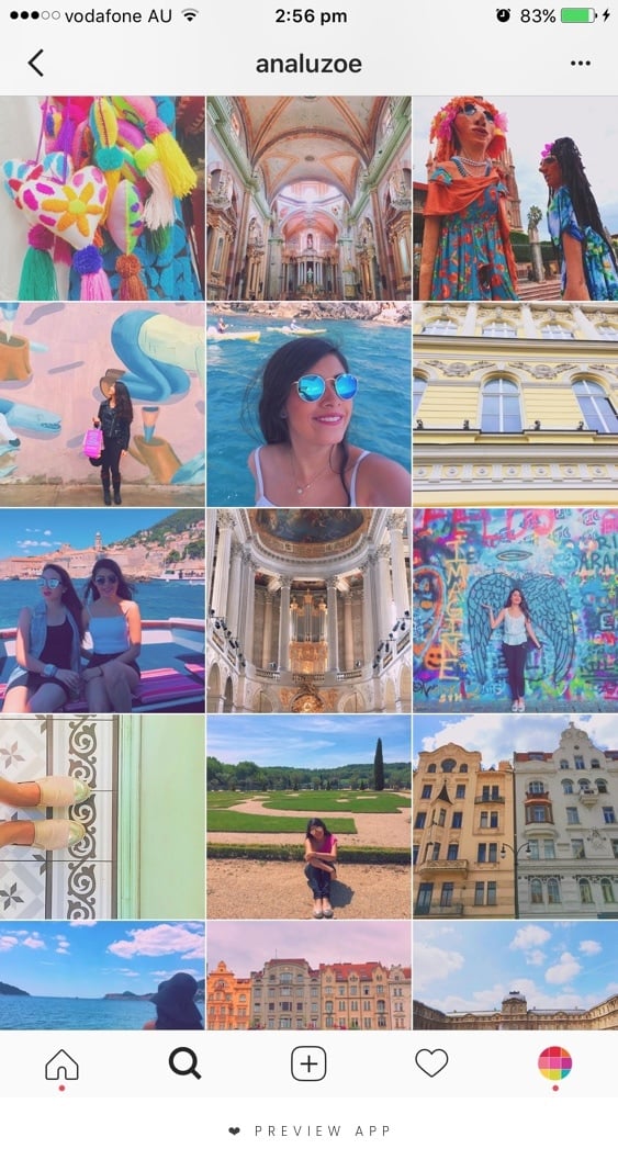
4. Rainbow theme
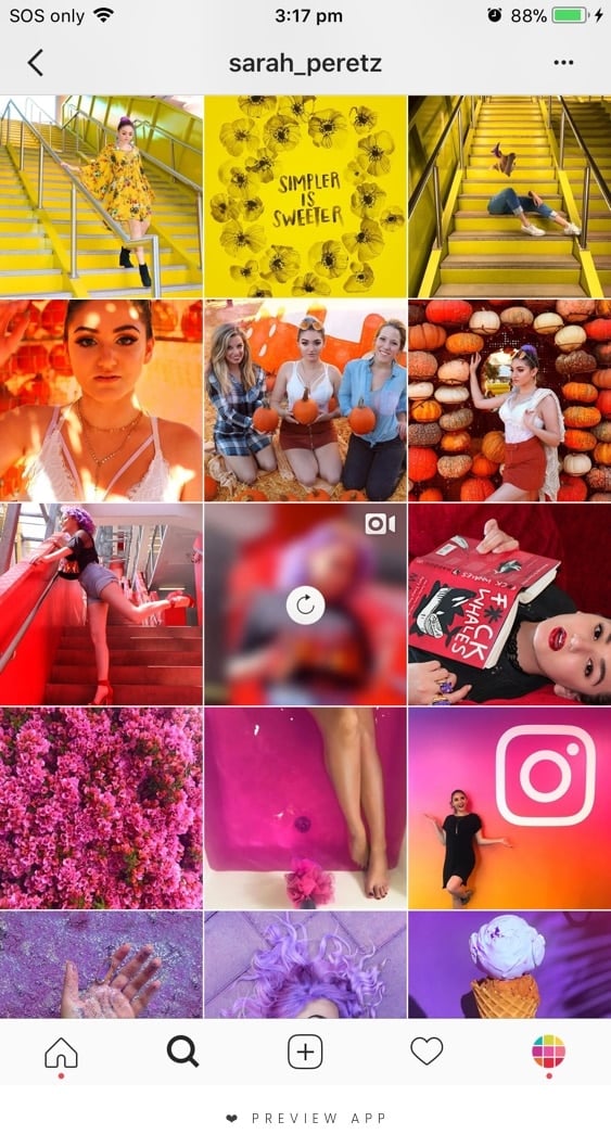
Rainbow feeds are rare. If you pull it off, your account will definitely stand out. A rainbow feed is when the colors in your photos change as you scroll down your feed. It looks like a rainbow.
5. Puzzle theme
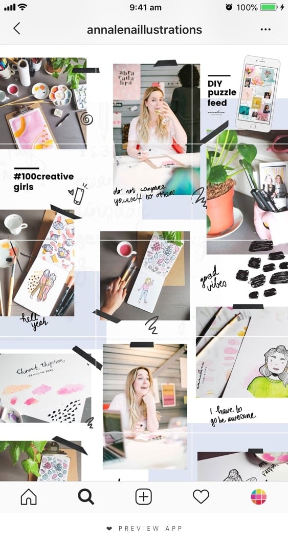
A puzzle theme is when all your photos are linked together and form a bigger picture. The trickiest part of doing this layout is maintaining high quality of each single image after you split the big image. You also want to make sure that each individual photo makes sense on its own (otherwise people won’t click on it).
6. White border theme
Using a white border on your photos is one of the easiest ways to start a theme.
Even if you share very different photos, with different colors, your overall feed will look consistent. White borders add space between your photos. They make your overall feed breathe.
Also, white borders are awesome to make your photos stand out on the Explore page and Hashtag Pages on Instagram.
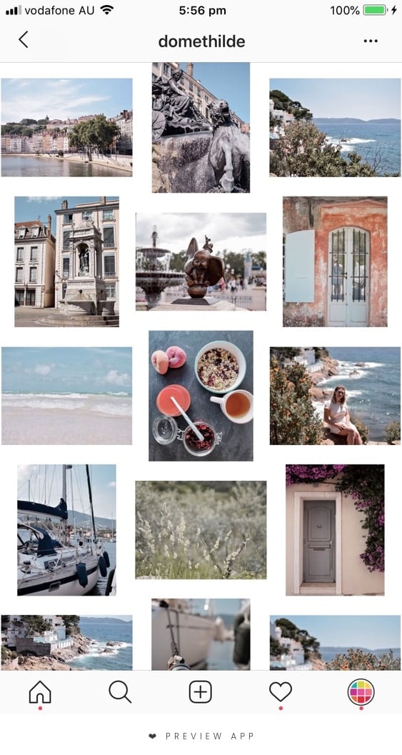
There are many border options in Preview app. Our favorites are “Aura”, “Vela” and “Sole”. Here are some examples to give you ideas:
NOTE: The borders are not available in Preview anymore. We are working on brand new borders. You can still use Preview to plan your feed in advance, use our beautiful filters, and find the best hashtags. If you are looking for borders some alternative apps we recommend are Instasize, Pic Stitch and Photo Collage.
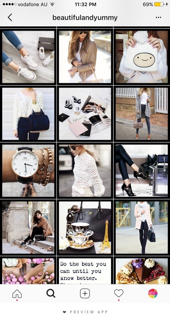
7. Black border theme
Black borders are very rare on Instagram at the moment. So you will definitely stand out.
Dark borders are perfect for dark themes, like Grunge and Moody themes. Also, black borders would look really nice on minimal photos and on photos with strong pops of colors.
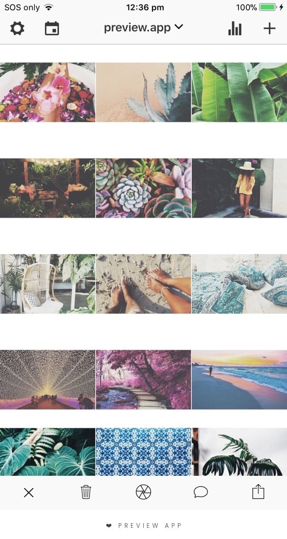
8. Rectangle photos theme
This theme idea is elegant and different.
This theme idea is perfect if you want your viewers to focus their attention on one part of the photo. In fact, I think it highlights the most beautiful parts of a photo.
We can appreciate the details and colors more. It almost seems like a photo tells a story.
Why? Because each photo is separated by a lot of white space. It gives us, the viewers, time to appreciate each one of them when we scroll down.
This theme will also catch viewers’ attention because it is not the usual “squared photo” in the Explore page.
To make this theme, use the white border in Preview app called “Sole”.
9. Mixed white border theme
Last theme with borders I promise.
I love this one because it is totally different. It is very playful. Each image can shine on its own because there is a lot of more space between them. It is a great theme for any type of photos and colors.
In Preview app: Use borders “Vela” and “Sole”.
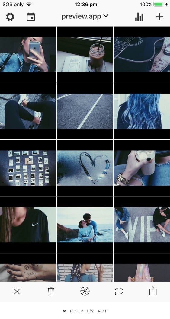
10. Same filter theme
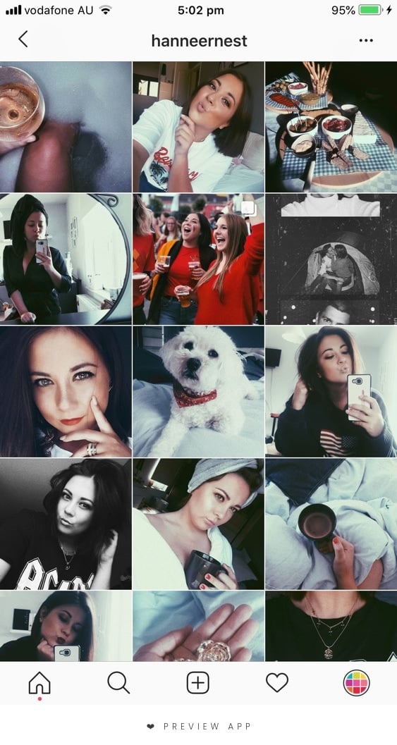
This theme idea would be the first one I recommend to you if you have no idea where to start: use the same filter on your photos, all the time.
Your filter will become your signature look = your style.
People will recognize your photo straight away if you use the same filter all the time.
Using the same filter all the time is the easiest way to start a theme. It makes your overall feed look cohesive when someone looks at your feed for the first time.
Also, the same filter gives an overall mood to your whole feed. So choose wisely based on the type of photos you take (new blog post about this coming soon).
In Preview app: Choose one filter and stick to it. Use the Filter Packs to guide you to pick the theme you want to focus on (for example: Tropical, Grunge, Moody, Pastels, Brown, etc…).
11. White background theme
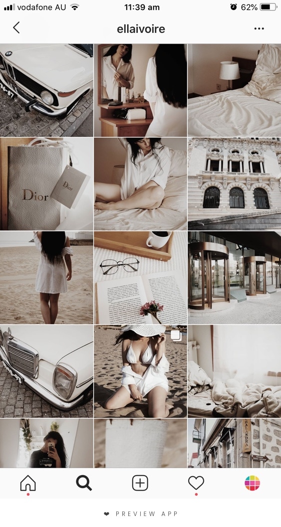
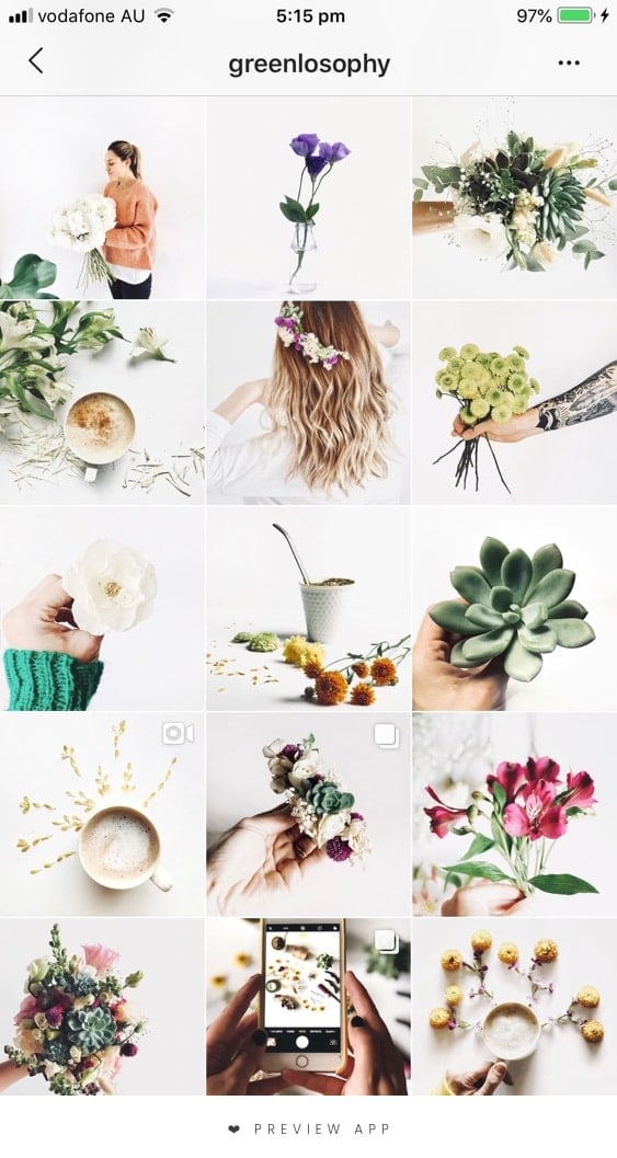
White Instagram feeds themes are beautiful.
You have to know that keeping a white theme is a lifestyle. You need a lot of light (natural light is the best). And you need to surround yourself with white to make your photos pop. If you already have a lot of white around you, then this theme will be so easy to do. If not, it might require more thought and planning.
In Preview app: I recommend two things:
- Use the two White Filter Packs to make a white theme
- Use the whitening tools (in the Photo Editor) to whiten the whites in your photos if they are not white enough
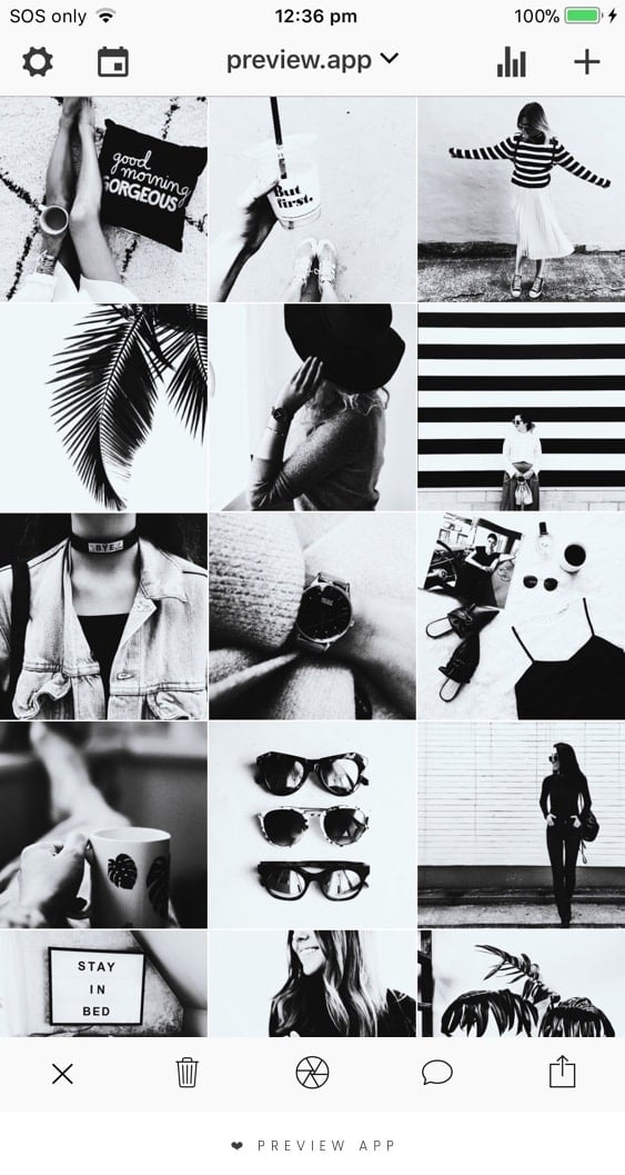
12. Bright and white theme
If you don’t want to always keep the background of your photos white, but you want to bright, white theme, you can still achieve this look by using the White Filter Packs in Preview. Here is some inspiration:
13. Dark theme
Another favorite on Instagram is the dark theme.
Everything is underexposed. Photos are dark. It looks mysterious and the feed looks very well put together.
In Preview app, try these filters:
- Filter A8 in the Preview Pack
- Filters in the Moody Filter Pack
- Filters in the Dark Filter Pack
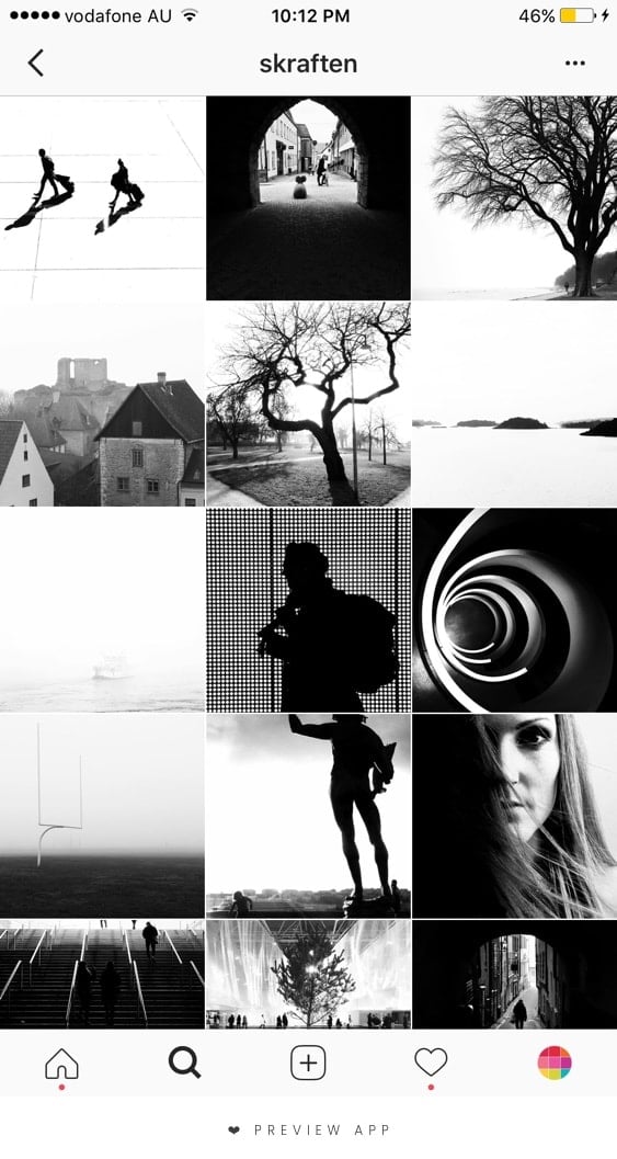
14. Black & white theme
If you’re feeling adventurous, try a black and white theme.
They are very powerful themes. No color distraction. You let your viewer appreciate the subjects in your photos, in all their beauty.
There are different types of black and white filters. You can also play with the textures in your photos to give them an extra edge. Have a look at these cool photography tricks to make your photos stand out.
In Preview app, try these filters:
- A6 in the Preview Pack
- B7 and B8 in the Essentials Pack
- Filters in the Black & White Filter Pack
15. Color coordinated theme
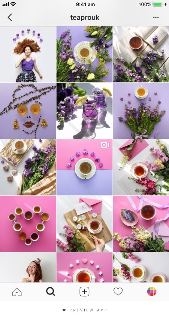
Choose a color palette to make your theme.
Choose one, two or three colors that you will always use in your photos. These colors will be the base of your feed. They will link all the photos in your feed because the colors will repeat themselves here and there. Colors make your feed flow (and if you’re a business, they brand your content).
Stick to the same color palette all the time and you have a winning color-coordinated theme.
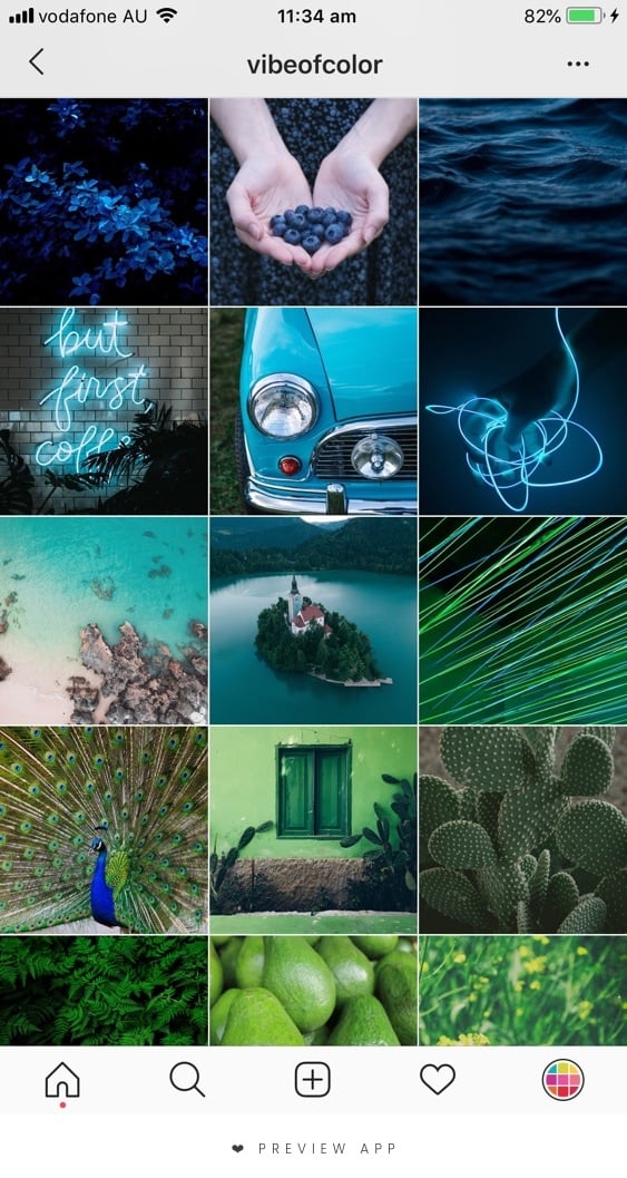
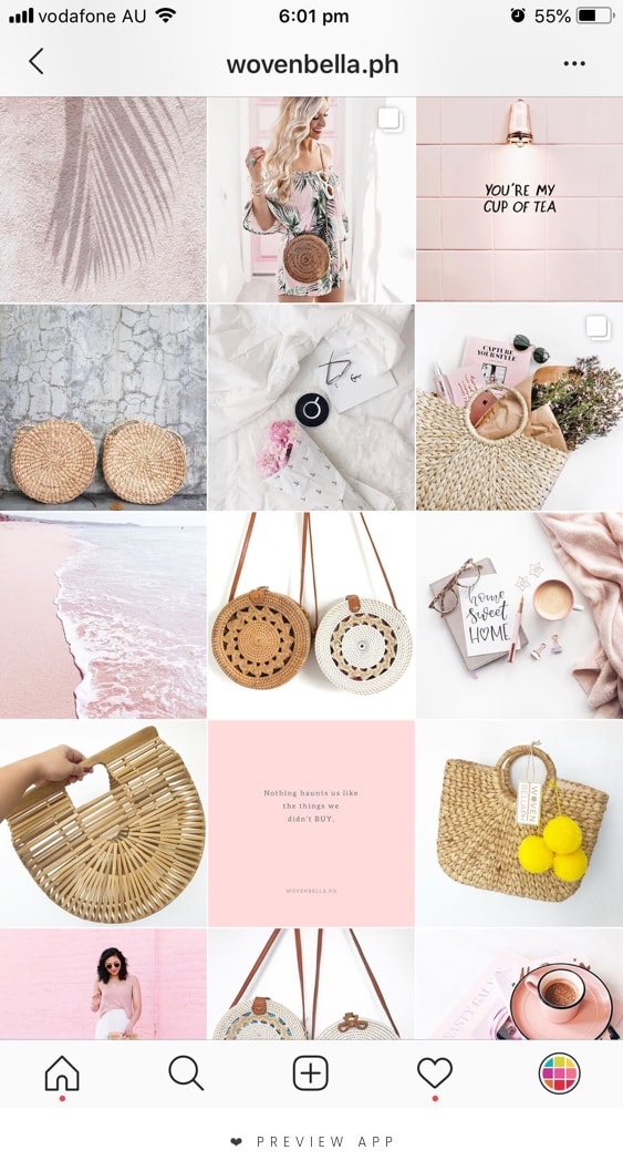
Look at the feeds below for example:
- @wovenbella: Pink and white
- @esterslowdesign: Green, blue and white
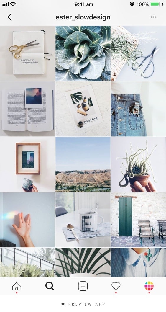
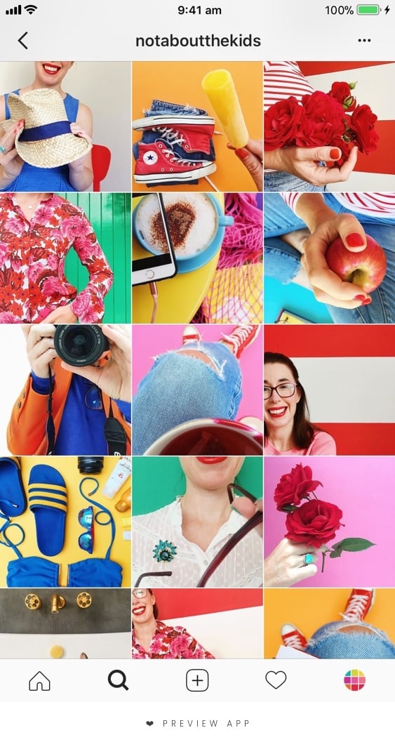
16. Color block theme
If you take very colorful photos. Then you might want to try a color block theme.
They are very popular on Instagram at the moment.
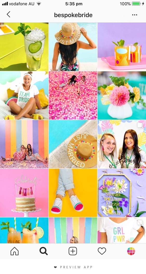
They can be with high saturation or light pastel colors. Either way they are a very fun feed to maintain. The trick is to make sure the background of your photos are a strong color.
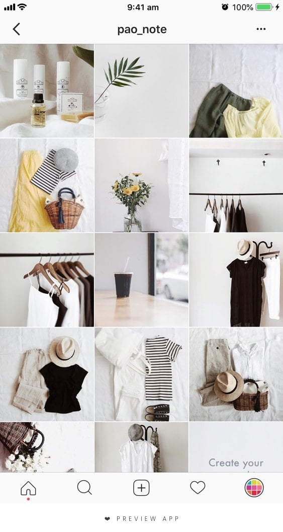
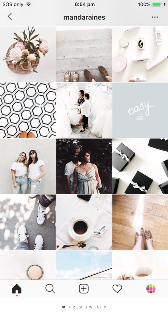
17. Minimalist theme
If you want to challenge your creativity and imagination, try a minimalist theme.
It is absolutely beautiful to scroll through.
One tiny detail in your photo has the power to tell a whole story.
18. Monotheme
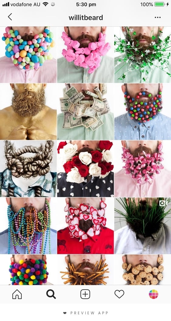
A monotheme is a theme showing the same subject all the time (and sometimes in very creative ways).
If you are passionate about one thing, then try doing a monotheme.
19. Flatlay theme
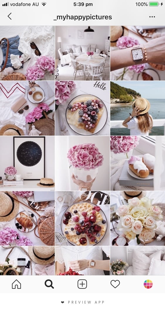
Flatlays = or the art of taking a photo from above.
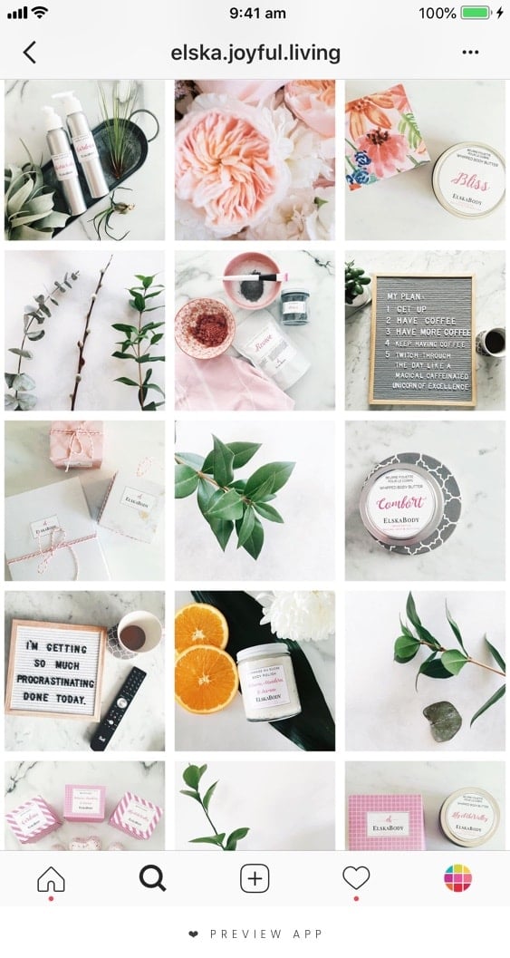
You can tell your story in one flatlay: what you ate this morning, what you love to wear, what you love to use, your current mood.
The trick is to let your imagination run wild. Spread your favorite things on a surface elegantly.
It is rare to find a personal account that focuses on flatlays only. My favorite accounts are @mich.elle.imagery and @_myhappypictures.
20. Drawings in your theme
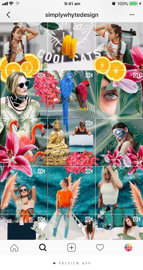
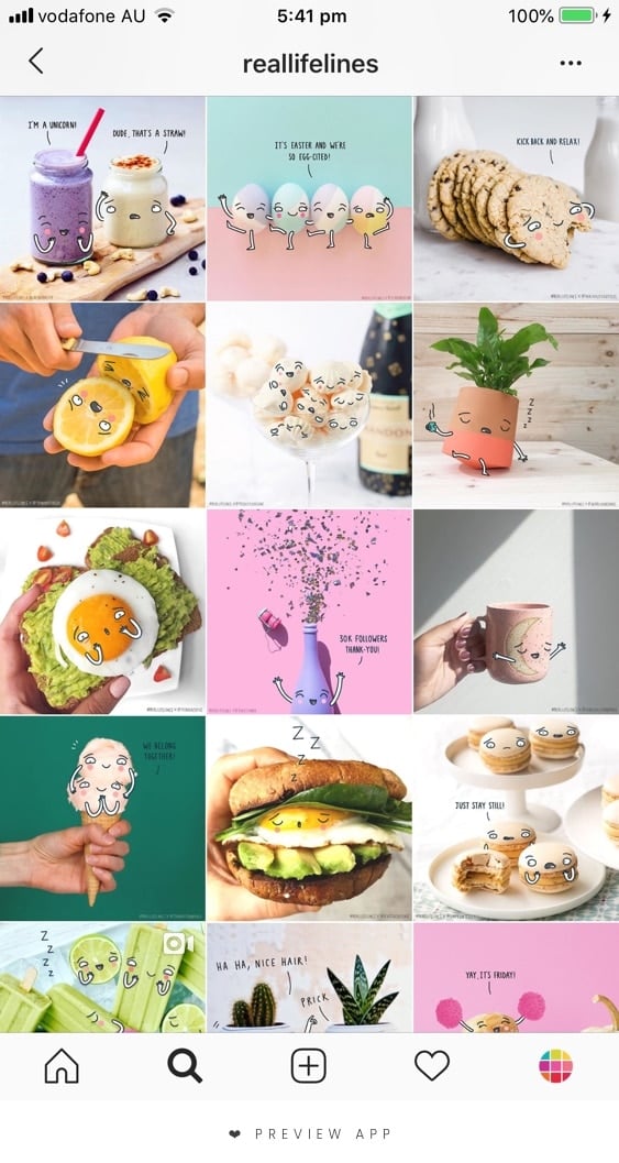
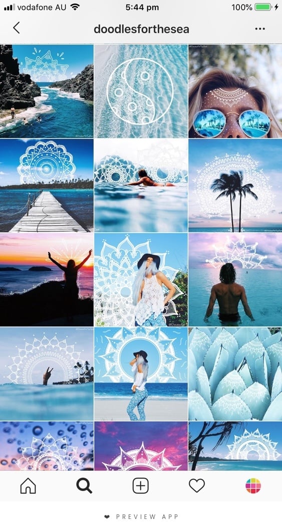
Another cool Instagram theme idea is to draw on your photos. It will really make your photos stand out because it is… unusual.
Drawing on a photo will definitely catch people’s attention.
You don’t need to be a professional artist. Sometimes a few strokes are all you need to accentuate a detail.
21. Color splash theme
And the best for last… I think using color splash is a fantastic and super creative way to make a theme.
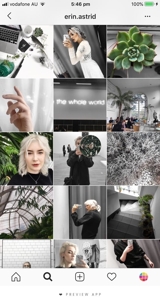
They are hard to find on Instagram, but a perfect example is Erin (@erinastrid). She uses the Color Splash tool in Preview.
When you use the Color Splash tool, your photo becomes all black and white. And then you select which part of your photo you want to still have colors. To select which part you want in color, just brush over it with your finger.
That’s it! Which one is your favorite theme?
I honestly like them all. I do have a sweet spot for the white, borders, line in the middle and rainbow themes… and puzzle themes! What about you?
We have more Instagram tips for you: Click here to see them all.
Have fun making your theme!


OMG, Your blog is really good. I am a new blogger/youtuber and I am looking for tips and tricks online. Definitely returning to this blog. Keep it up!
Thank you! I’m super happy you’re enjoying all the tips. See you around!
Awesome ideas! I’d love to try these for establishing a unique brand identity on instagram. Loved the concept. Thanks for sharing, Alexandra.
I’m in love with all things minimalist, so the black & white examples are my faves! There are some great examples in here too: https://schedugr.am/blog/instagram-feed-ideas/
What about the videos?
I agree. How do you maintain your feed theme if you are posting videos, too?
Insta gives an option to change your video thumbnail, so choose one that suits your feed. Sometimes (if it’s a personally made video) people intentionally add a clip or two just so that it can be a thumbnail which matches their feed.
it’s not even letting me upload photos from dropbox or any folder that I have on my phone….
I have not come across some of these features you mentioned in your app. Are these features available to the paid users alone?
veri nice idea .. i like to combine quotes and graphic .. thank you
Very Nice!!
Hey! Nice Article keeps it up with your Good work.
This Article will also helpful to the visitors.
Really Nice 🙂
Thank you for sharing a such a content very useful to me.
I have learned a lot from this article.
QuickStartApps
Definitely helpful… Only problem i’m having is too many choices 😂
All the ideas are awesome .
thank you guys , i found it helpful 🙂